Microsoft Engage 360
I redesigned Microsoft’s all-in-one ESXP (Enterprise Service Experience Platform) and integrated it into the new Engage 360 platform.
The ESX Platform is an internal Microsoft platform designed to streamline and unify various enterprise service processes. It integrates approximately 10 distinct tools to manage the entire lifecycle of service delivery, encompassing stages from lead generation and agreement management to service delivery.


OVERVIEW
Redesigning Microsoft’s ESXP to Create a Unified, Seamless Experience Within the Engage 360 Platform
For this project, Microsoft aimed to redesign their all-in-one ESXP (Enterprise Service Experience Platform) and integrate it into the new Engage 360 platform. The goal was to enhance the user experience, streamline navigation, and provide a seamless, single-click solution for users.
This large-scale initiative involved consolidating multiple platforms, reimagining user experiences, and optimizing workflows. Working closely with various Microsoft stakeholders, our team delivered a unified experience tailored to diverse user groups, including those in client success, sales, and marketing.
MY ROLE
Lead UX Designer – End-to-End ESXP Platform Re-Design
I was responsible for managing the end-to-end design process with a dedicated focus on improving the experience for Microsoft’s Customer Success Account Managers (CSAMs).
I collaborated closely with cross-functional teams including product managers, developers, and Microsoft stakeholders to ensure the solution was scalable, aligned with Microsoft’s design standards.
MY ROLE
Initial Research
Wireframes
Visual Mocks
Usability Testing
Dev Handover
TEAM
1 Project Manager
(MSFT side)
1 Developer (MSFT side)
1 Designer (myself)
TOOLS
Figma
Azure Dev Ops
TIMELINE
6 months
OUR CHALLENGE
Simplifying Complexity for Better Usability - Redesigning a Cluttered, Confusing Tool into a Clear, User-Friendly Experience
The challenge with the existing platform was that it wasn't designed with a specific persona in mind, resulting in an overload of information for our target users. The legacy system was outdated, requiring users to click through multiple steps to access the information they needed. Additionally, there was no easy way for users to drill down to the level of detail they sought or quickly find the information they required.
PROBLEM STATEMENT
The existing platform lacked a persona-driven design, resulting in information overload and inefficient workflows for CSAMs.
Users faced difficulty accessing relevant data quickly, with outdated navigation patterns requiring multiple clicks and offering limited ability to drill down into details.
GOALS
Key Product Goals That Shaped the Experience
My goal was to design an intuitive, insight-driven interface that supported CSAMs in delivering value to enterprise clients.
1
Reduce Clicks: Simplify navigation for a one-click user experience.
2
Relevant Information: Present only the most pertinent content, allowing users to drill down into detailed data.
3
Streamlined Design: Replace the outdated tabular format with an intuitive, modern design.
4
Enhanced Usability: Ensure users can easily locate the information they need with minimal effort.
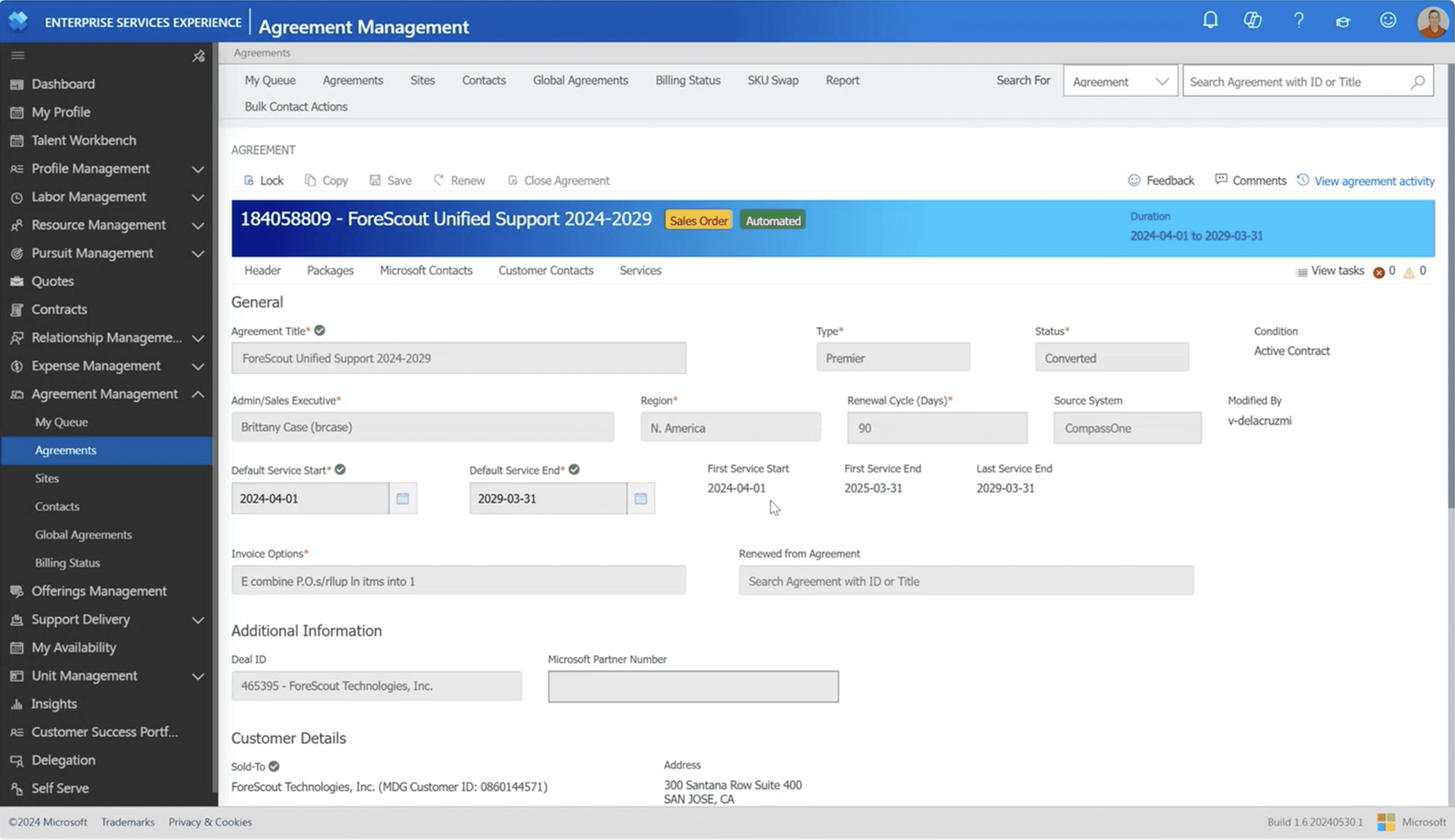
LEGACY SCREEN - AGREEMENT SECTION
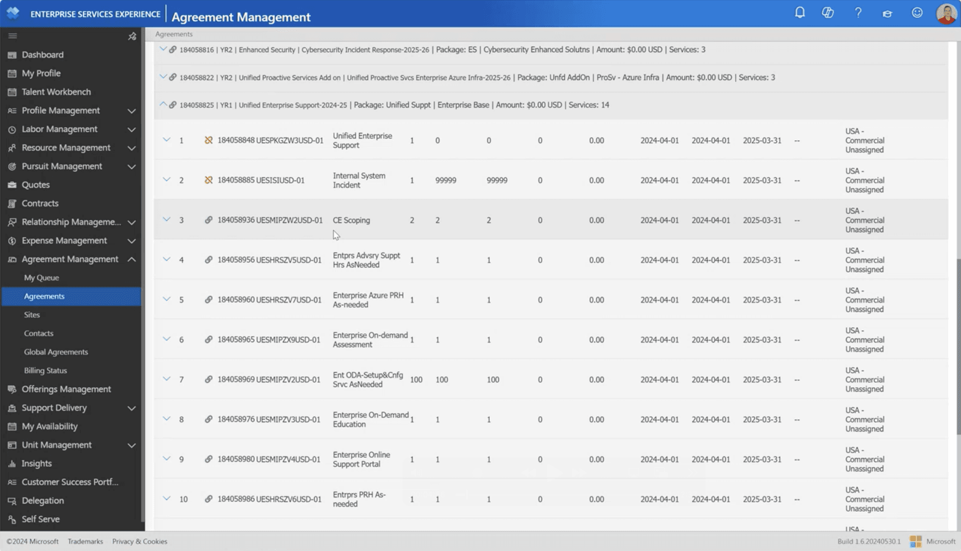
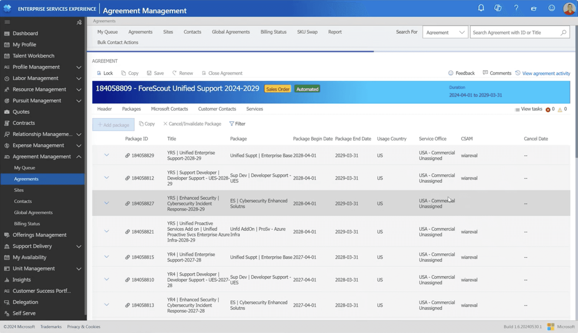
LEGACY SCREEN - PACKAGES SECTION
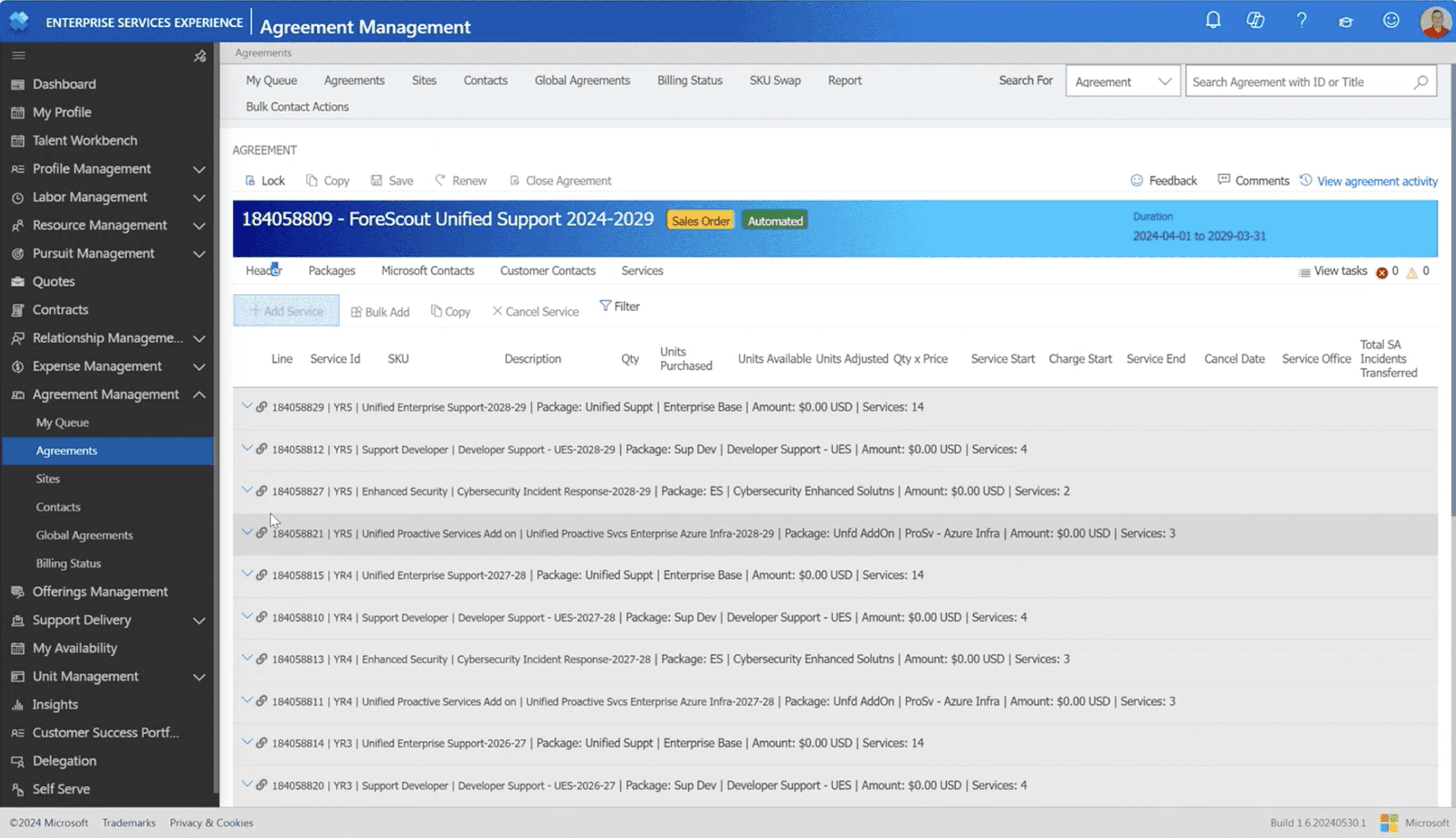
LEGACY SCREEN - SERVICES SECTION
USER RESEARCH
Understanding ESXP and the CSAM Workflow
Deep-diving into platform structure, user needs, and content relevance
I started the research process first by understanding the platform functionality and workflow analysis.
1
Platform Understanding: Conducted a thorough analysis of the existing ESXP platform to understand its structure, how each section functions, and the data within.
2
Information Inventory: Identified and categorized the different types of information within the platform (e.g., agreements, packages, services) to assess what’s most relevant to the user.
3
Critical User Needs: Focused on understanding the daily information needs of the C-SAM persona, identifying the key details they need to access quickly and efficiently.
4
User-Centered Prioritization: Based on the gathered information, I prioritized content based on what’s most crucial for the user, ensuring the design would help C-SAMs access vital data.
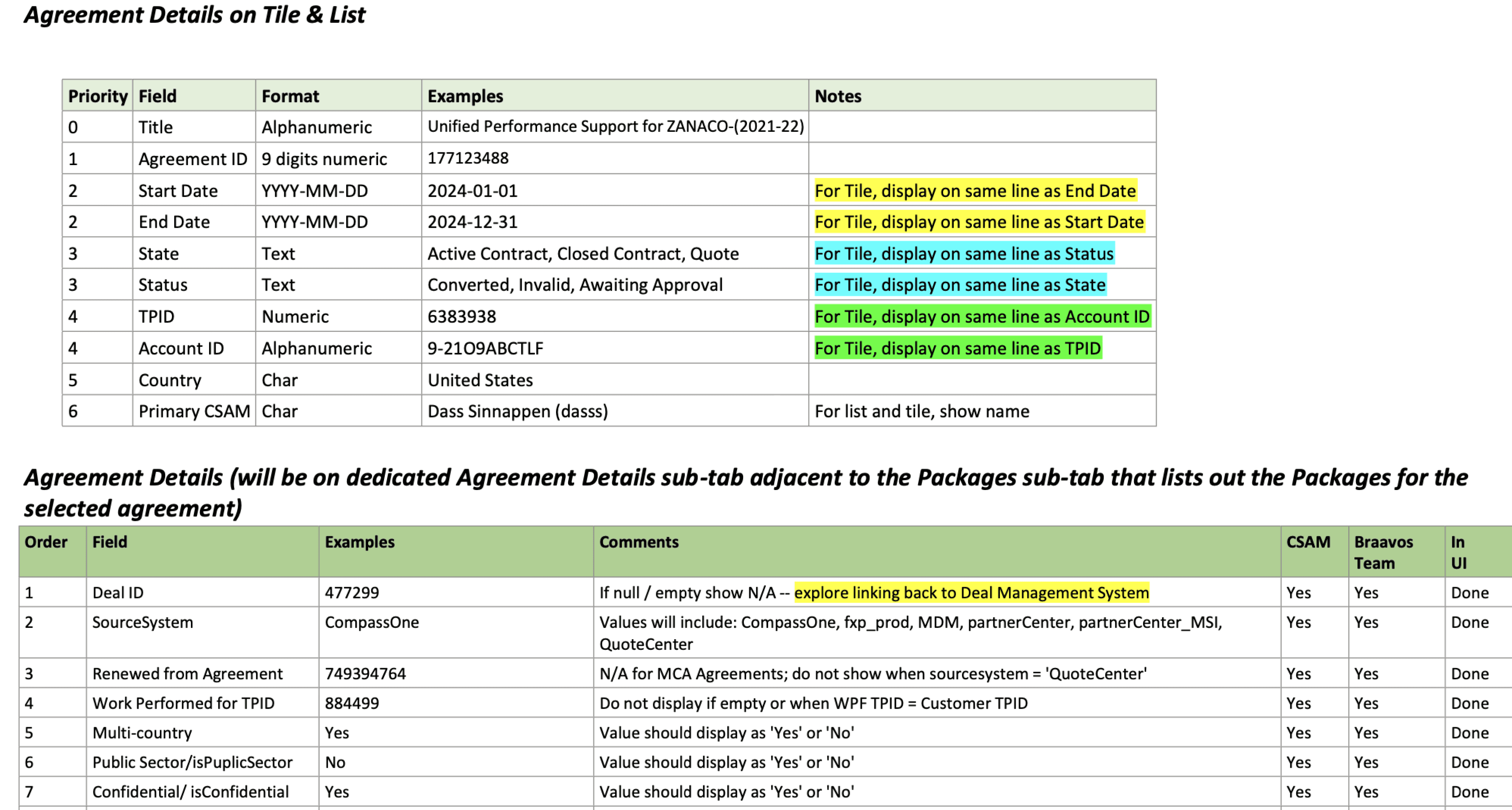
Agreement details field tabs inventory and prioritization
KEY RESEARCH INSIGHT
The CSAM needed a platform that minimized clicks (ideally one click), provided relevant information with the ability to drill down to detailed insights, and offered an intuitive, out-of-the-box design rather than a traditional tabular format.
WIREFRAMES
Initial Designs and Iterations
Scalable and Flexible Design: Addressing Common Case Scenarios i.e. 98% of the use case.
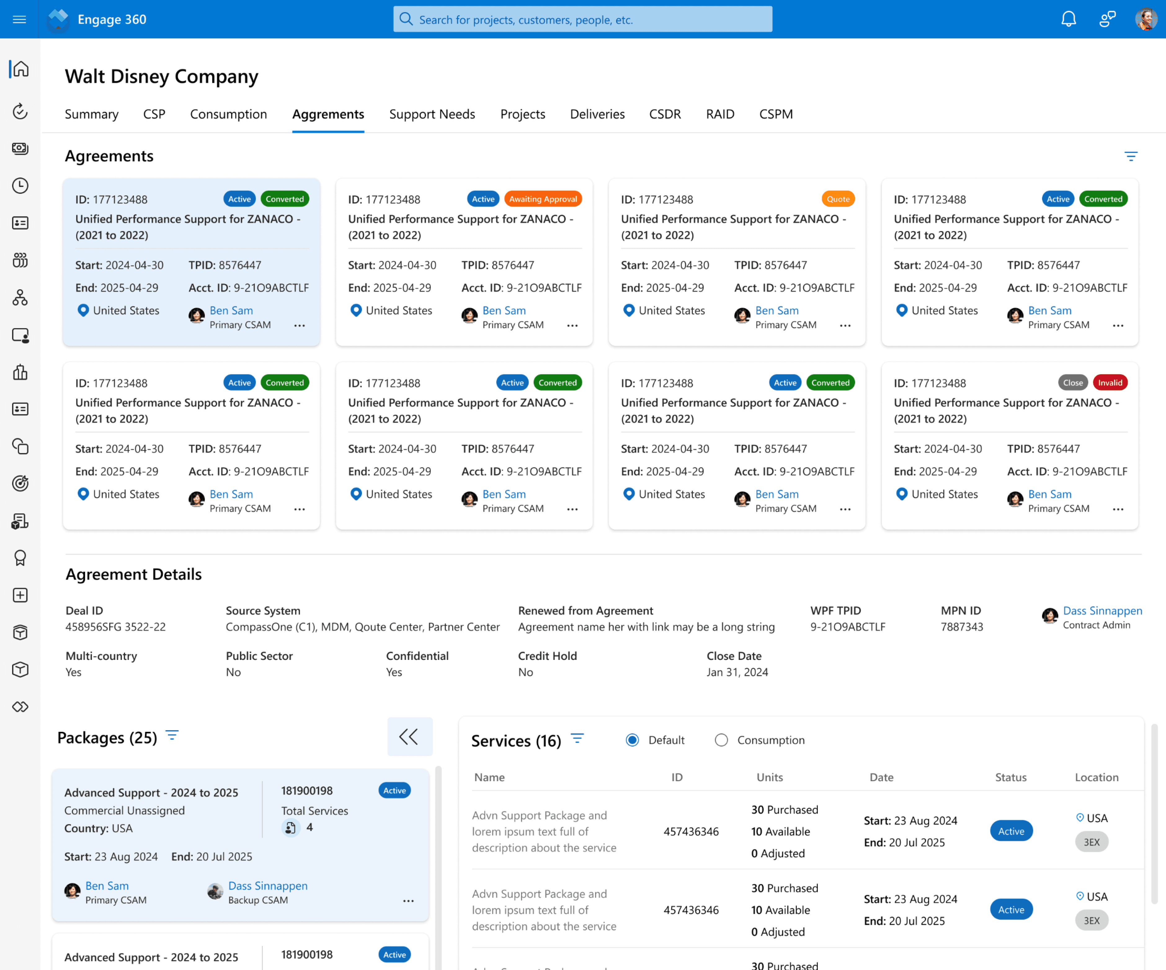
While designing the initial wireframes, my primary focus was ensuring that CSAMs could quickly and easily access the most relevant information with minimal clicks. I aimed to streamline navigation, allowing users to find what they need effortlessly.
I prioritized reducing information overload by presenting only the most essential data, ensuring that every detail displayed on the page was meaningful and relevant to the CSAM's workflow.
Re-designed screen
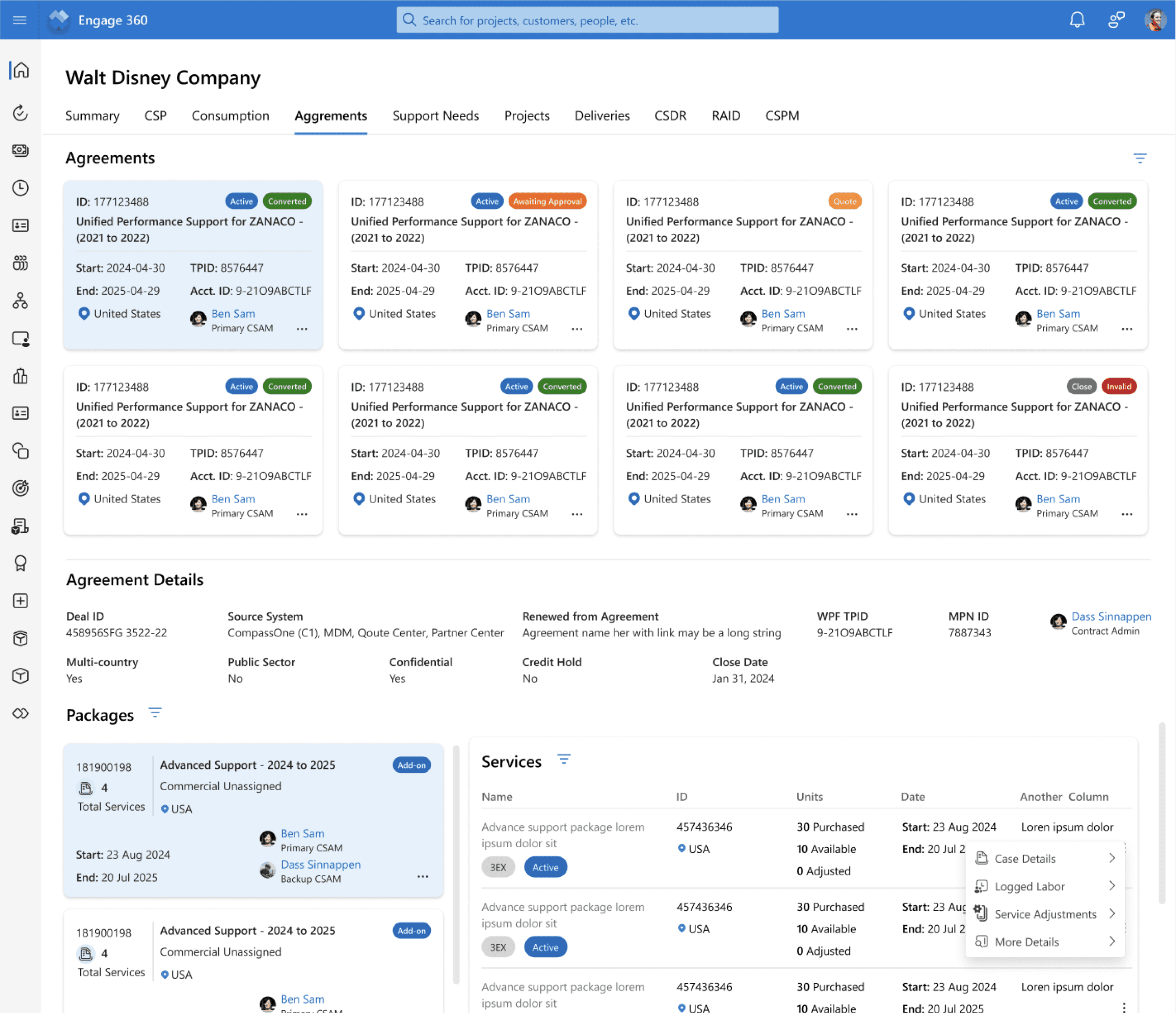
Agreement Section
Package Section
Services Section
DESIGN CHALLENGES & CONSIDERATIONS
Making Complexity Work: Designing for Multi-Level Information, Solving for 1:M relationships, nested packages, and service-heavy views
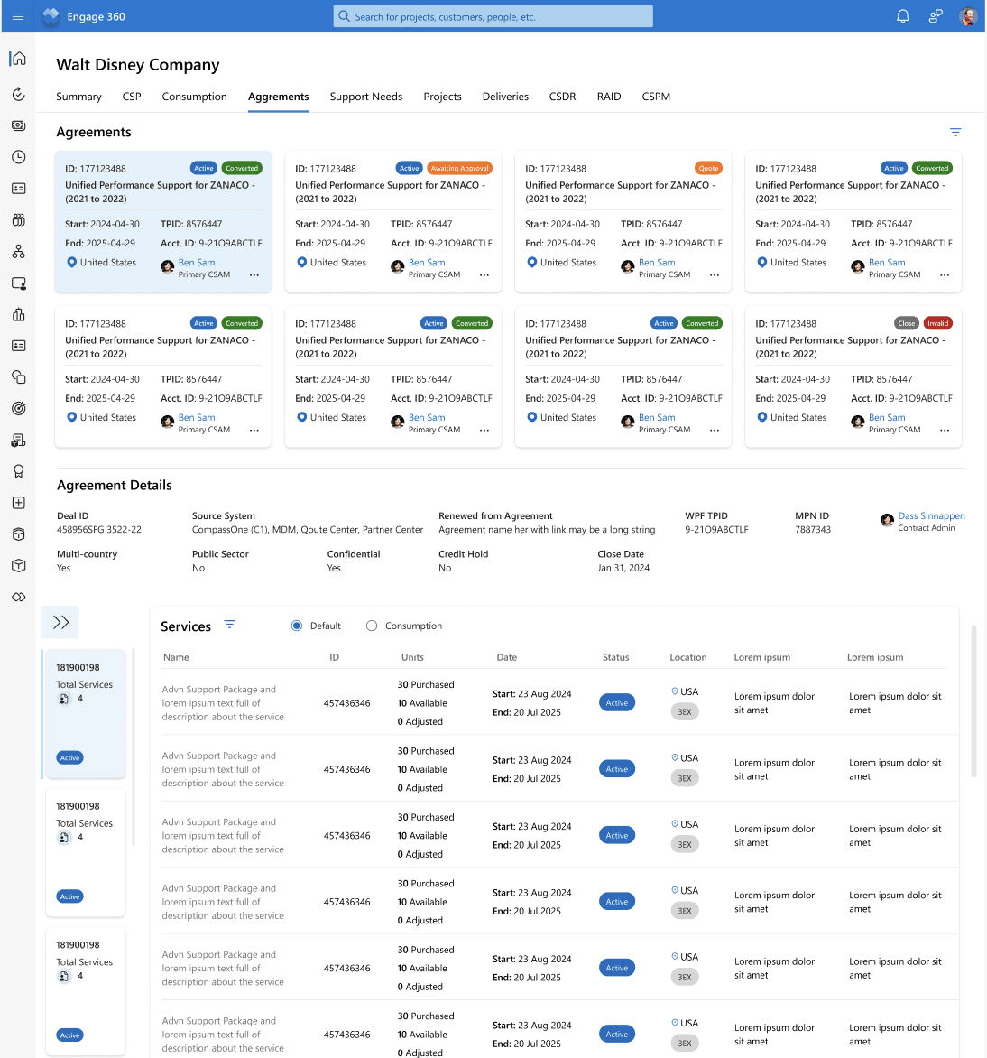
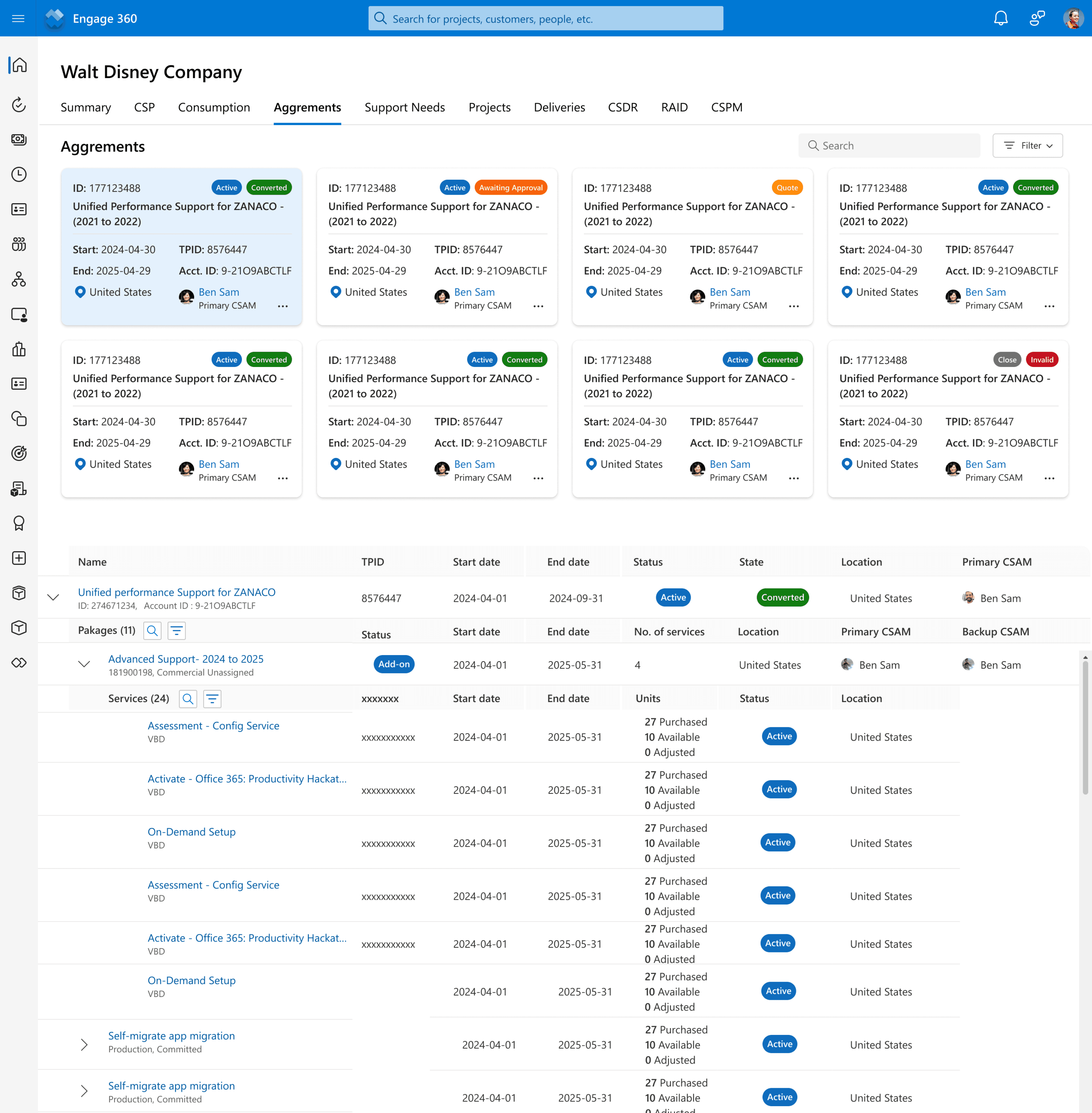
Complex Information Hierarchy: Customers could have multiple active agreements, with a 1:M (one-to-many) relationship. The vast majority (97%) had 1 to 3 agreements, but a small percentage (0.1%) managed 25–99 agreements, requiring a scalable and adaptable UI.
Simplified Layout: Redesigned agreement cards with a title-style format, showing only the most relevant details.
Quick Access: Additional information is available via the "more" icon to reduce clutter.
Clear Status Indicators: Used status tags for better visibility.
Optimized Display: Arranged in two rows of eight cards, considering the 97% use case.
User Behavior Insight: Data shows most users manage only 1 to 3 agreements, prompting a rethink on display density.
Improved Usability: The previous design had too much information at once—this version prioritizes clarity and efficiency.
NEW AGREEMENT SECTION
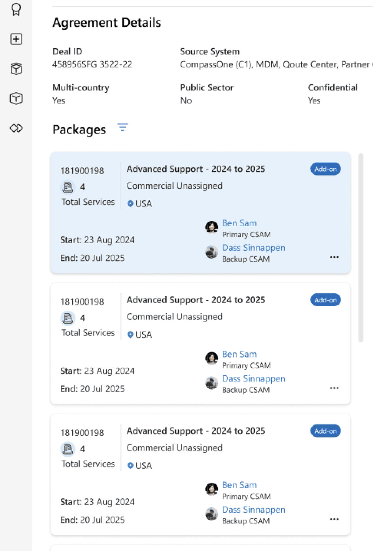
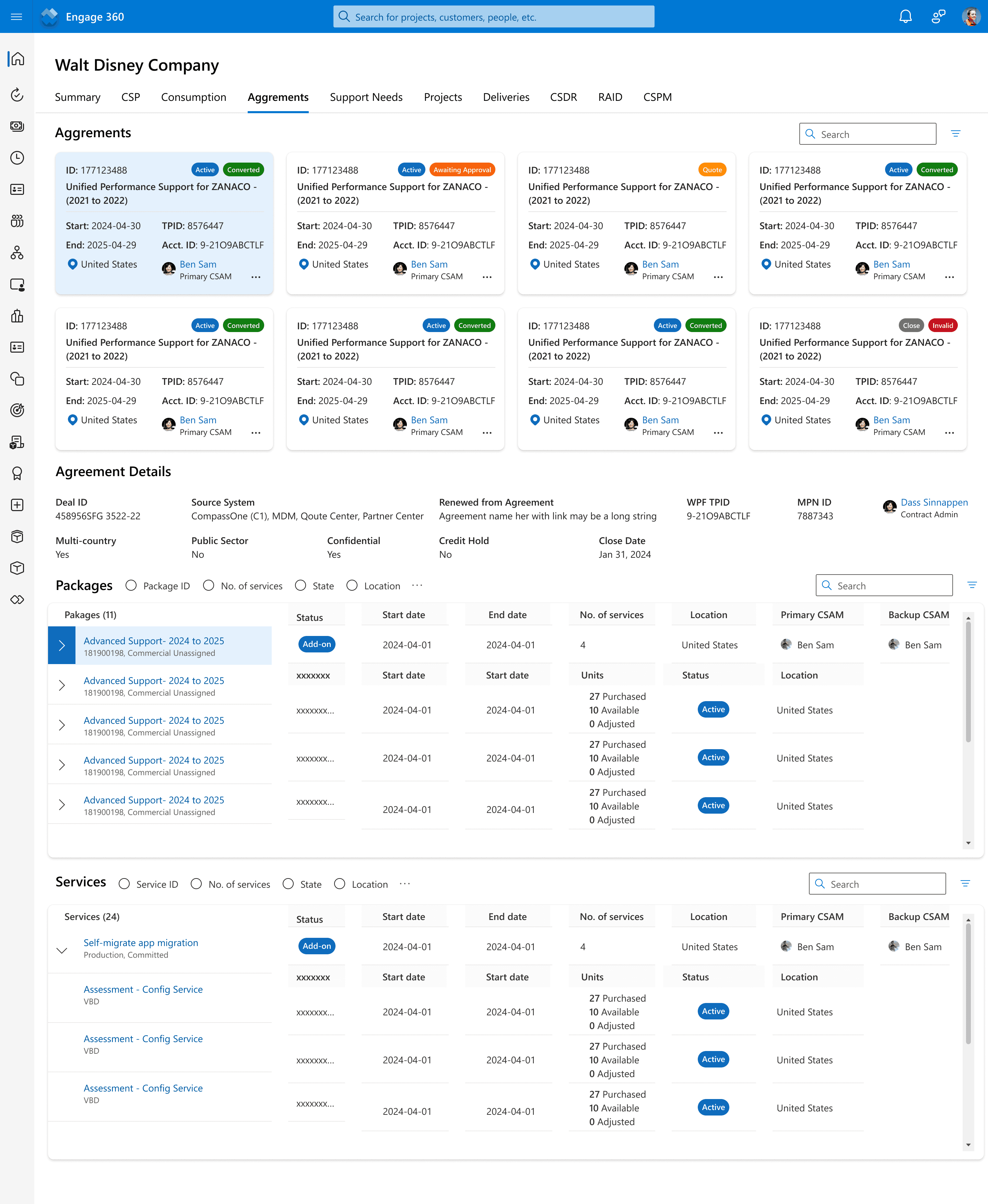
Nested Data Structure: Agreements contained multiple packages, with 97% of agreements having 1–9 packages, but some extended up to 170 packages. The UI needed to balance accessibility while preventing overwhelming complexity.
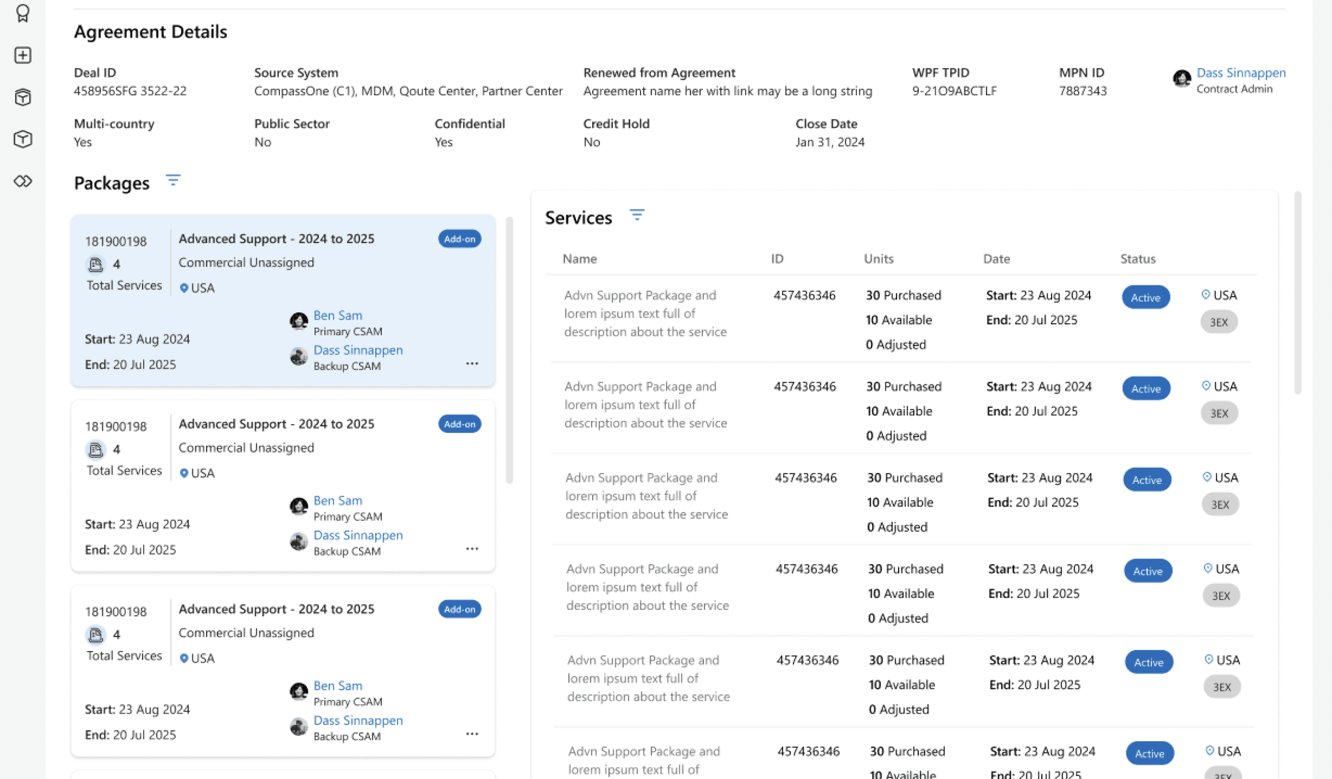
Expandable Packages: Clicking an agreement at the top reveals its packages below.
Scrollable Package List: Packages appear in a left-side scrollable section.
Quick Package Info: Package tiles show key details upfront.
More Details on Click: Clicking the "more" icon provides additional package details.
Integrated Services View: The right section lists associated services with key actions.
NEW PACKAGE SECTION
High Volume of Services: Each package included an average of 3–15 services, contributing to information overload. The challenge was to display essential data without overwhelming users while ensuring smooth navigation between services.
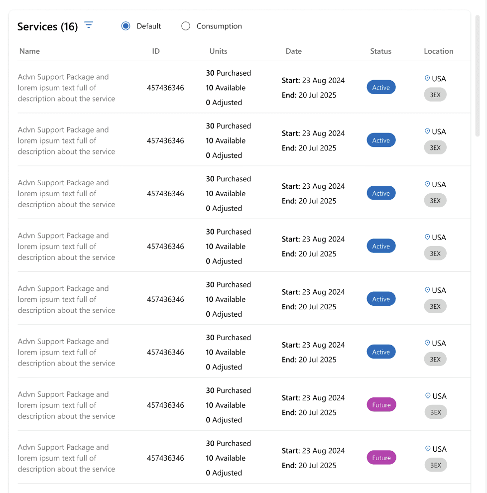
Better Organization: Users can now see all services in a structured format without the clutter of a tabular tree.
Improved Readability: The redesigned table makes it easier to scan key details like status, units available, and duration.
Enhanced User Interaction: Clicking on a package dynamically updates the right-side section, making it a more interactive and efficient experience.
NEW SERVICE SECTION
DESIGN VALIDATION
Collaborative Feedback for Iterative Improvement - Refining designs through direct input from CSAMs, PMs, and developers
After finalizing wireframes and design iterations, I engaged with key stakeholders—including CSAM personas, product managers, and developers—to validate the user experience. Their insights helped surface edge cases, usability gaps, and optimization opportunities, allowing me to fine-tune the design for real-world scenarios and enterprise needs.
KEY ADJUSTMENTS MADE
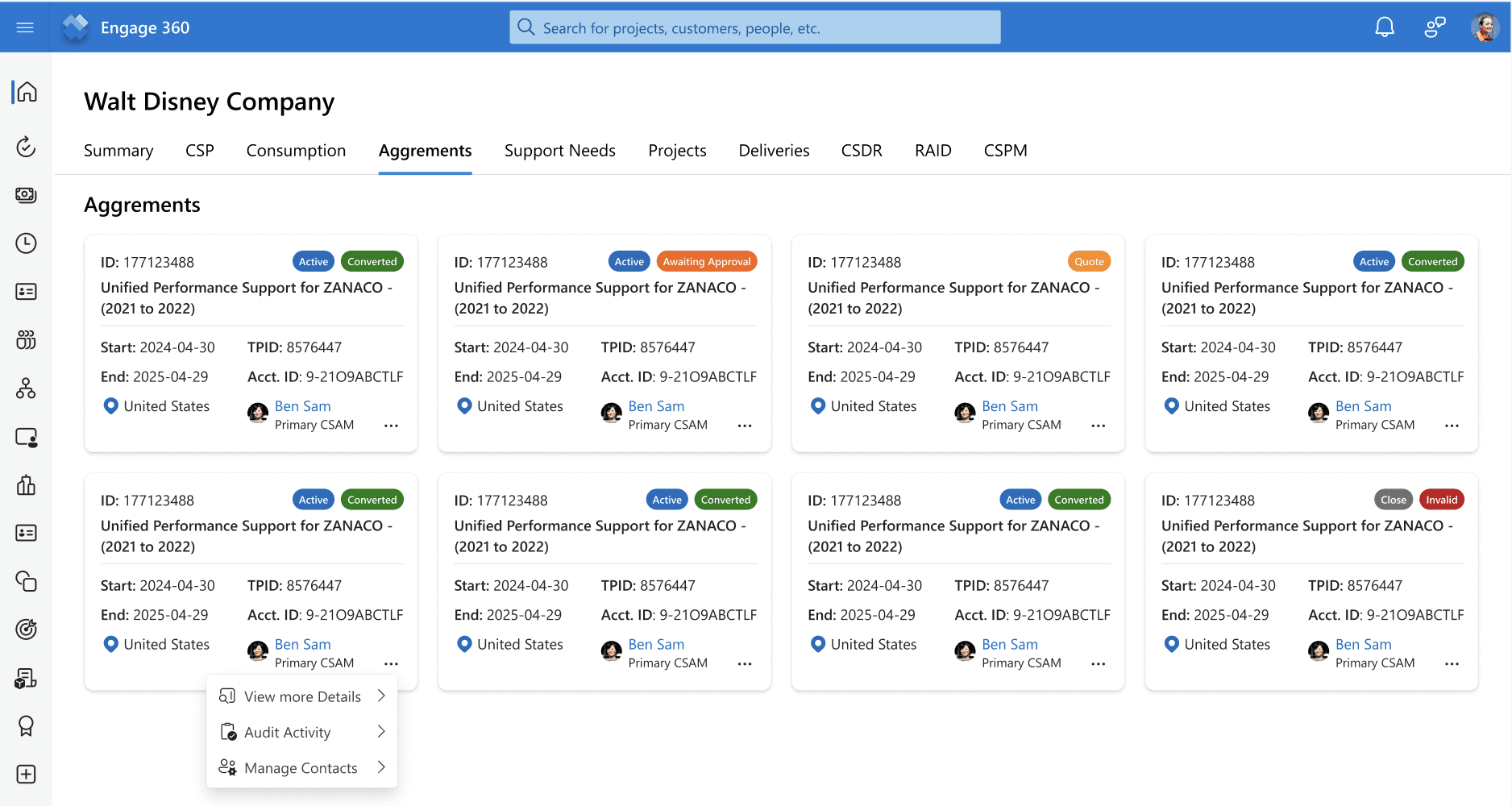
Optimized Layout for Efficiency
I enabled users to expand/collapse the package section, providing additional space for the adjacent "Services" section, improving workflow and usability.
Collapsable package section
SCALABLE, RESILIENT DESIGN THINKING
Redesigning Scalable And Future Proofing - Tackling For That 1-3% Use Case As Well
My primary focus was on designing for the 97% of common use cases, ensuring an intuitive and seamless experience for the majority of users. However, I also explored scalable iteration ideas to accommodate the 1–3% of edge cases, allowing for future enhancements. This approach ensured that the design remained adaptable, with potential alternate views or solutions that could be implemented as the platform evolved.
Scalable alternate view - Iteration 1
Scalable alternate view - Iteration 2
RESULTS & NEXT STEPS
A successful handoff with glowing feedback—and a new challenge ahead.
The transformation of ESXP into the Engage 360 platform received overwhelmingly positive feedback from stakeholders. 💙 CSAMs, in particular, loved the improved UX and shared how these enhancements made their workflow more efficient, intuitive, and seamless.
With the final designs handed off to the development team for execution, I was excited to see the vision come to life. As this project moved into the build phase, I was pulled into another exciting challenge within Microsoft’s ESXP ecosystem.