Microsoft Business Case Builder
I redesigned Microsoft’s legacy Business Case Builder Platform to create a more intuitive and efficient experience for Sales Professionals and Consultants, simplifying data input and ROI visualization.


OVERVIEW
Redesigned the Business Case Builder (BCB) to Deliver a Streamlined, Intuitive, and Data-Friendly User Experience
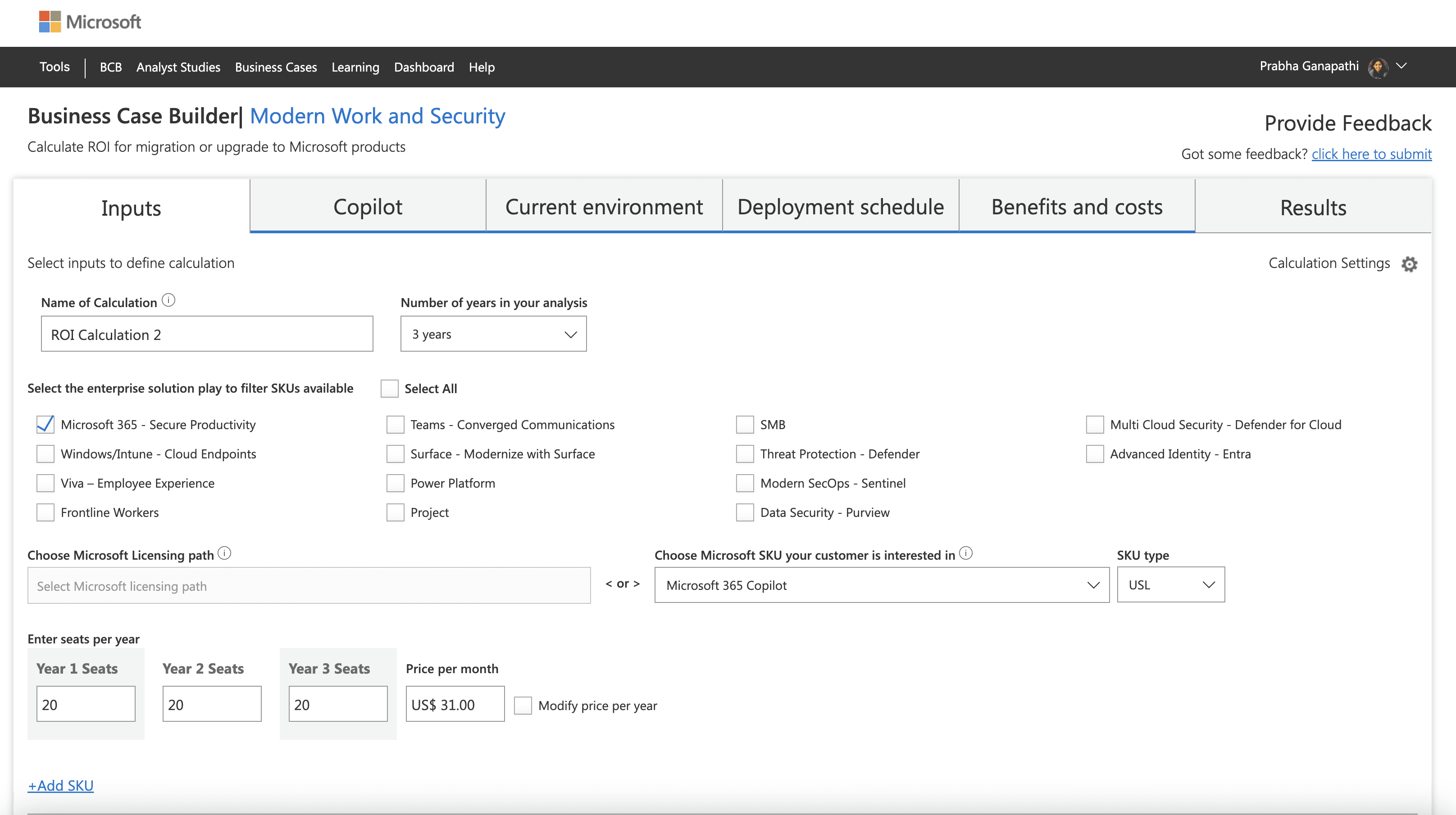
The Business Case Builder uses real customer data to show the ROI that organizations can achieve by adopting Microsoft solutions across Modern Work, Security, Surface and more.
Costs and benefits are calculated based on values from third-party Forrester TEI studies.
The tool provides standardized and custom calculations to help the sellers create a business case specific to their customer environment and needs.
MY ROLE
Lead UX Designer – End-to-End BCB Platform Design
I was responsible for managing the end-to-end design process. My focus was on enhancing the experience for sales professionals and consultants by creating an interface that was intuitive, data-accessible, and aligned with Microsoft’s design standards. I collaborated closely with cross-functional teams to ensure the solution supported seamless global enterprise adoption.
MY ROLE
Initial Research
Wireframes
Visual Mocks
Usability Testing
Dev Handover
TEAM
1 Project Manager
(MSFT side)
Microsoft Sales Team
3 Developer
1 Designer (myself)
TOOLS
Figma
Azure Dev Ops
TIMELINE
3 months
OUR CHALLENGE
Simplifying Complexity for Better Usability - Redesigning a Cluttered, Confusing Tool into a Clear, User-Friendly Experience
Our core challenge was to simplify the complex process of entering customer data, understanding ROI calculations, and presenting results while maintaining the tool’s analytical power and making it accessible to non-technical users.
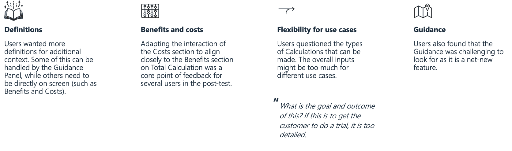
PROBLEM STATEMENT
The legacy platform was complex, static, and lacked visual hierarchy making it hard to distinguish key insights. New users often couldn’t understand what the calculations meant or referred to, leading to confusion, inconsistent inputs, and low trust in the ROI results.
USER RESEARCH
Collaborating with Product Managers to Understand the Platform’s Pain Points
To kick off the redesign, I conducted in-depth working sessions with the Microsoft Product Manager to understand the platform’s core functionality, user workflows, and business goals. These discussions helped me identify key usability gaps and pain points.
The Business Case Builder originally existed as a collection of Excel reports and was later transitioned into a minimal web platform with limited styling and a fragmented user experience.
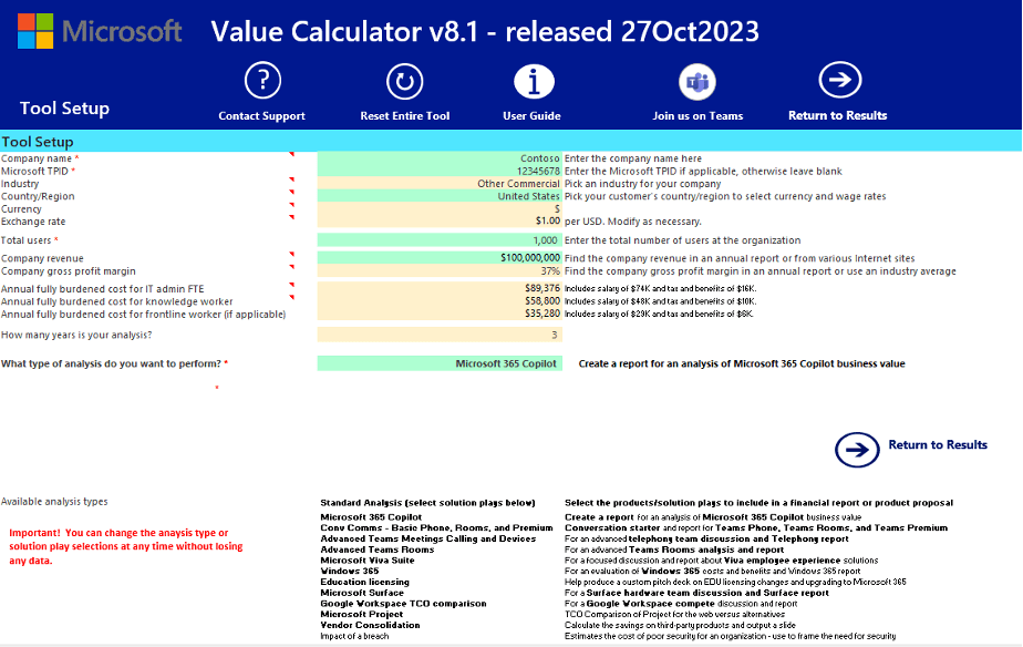
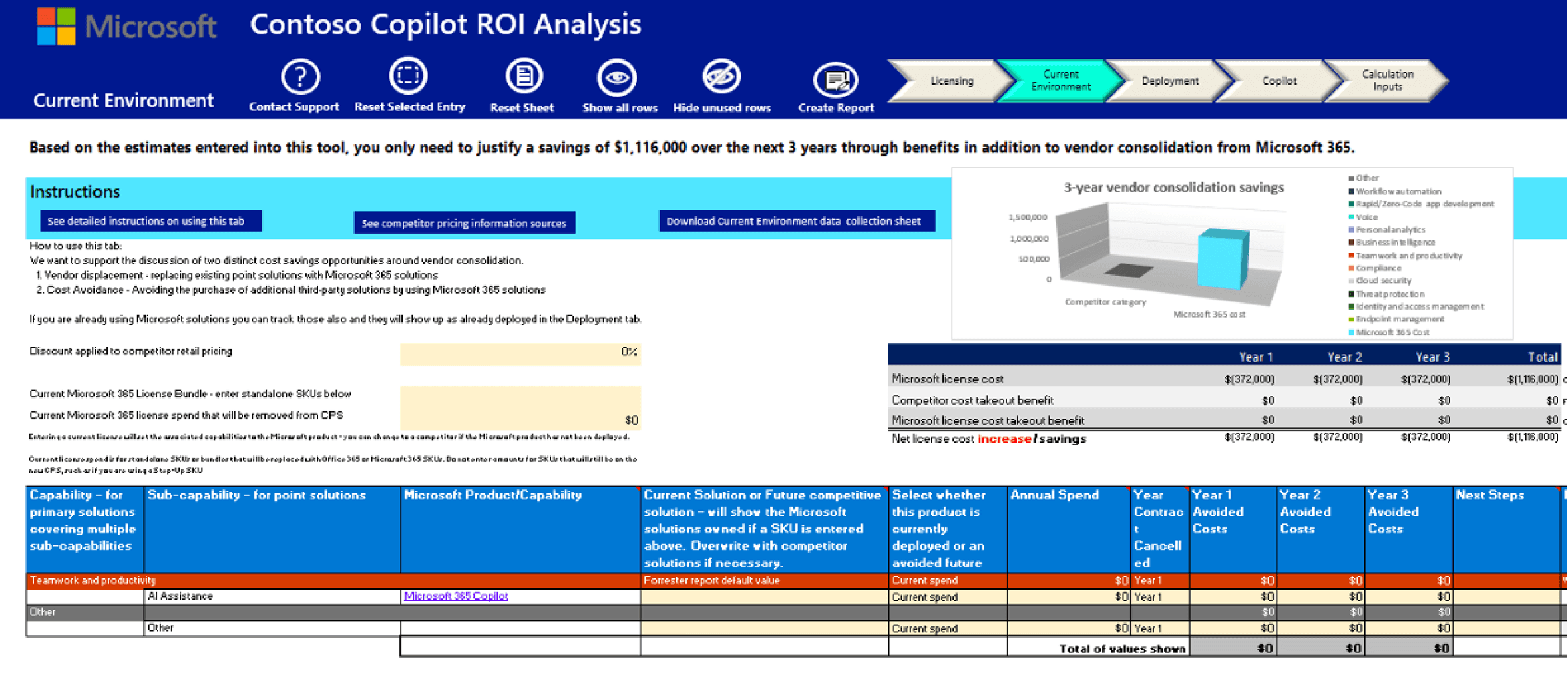
Current existing legacy platform
USER INTERVIEW
Uncovering Real User Pain Points: Insights from Sales Professionals and Consultants
As part of our user research, we interviewed three sales professionals and consultants who regularly use the Business Case Builder tool. These interviews revealed their key pain points
Information Overload
Pain Point: The platform presents too much information at once, without clear prioritization or grouping.
Quote: “I feel like everything is competing for my attention I don’t know what’s important.”
Lack of Clarity in Calculations
Pain Point: Users don’t understand what each calculation means or how it relates to their goals.
Quote: “I’m not sure what the numbers represent or how they’re being calculated.”
No Visual Hierarchy
Pain Point: All elements look the same, making it hard to identify what matters most.
Quote: “Everything looks equally important—I don’t know where to focus.”
KEY GUIDING PRINCIPLES
Key Product Goals That Shaped the Experience
1
Design a more intuitive user flow
2
Help users focus by presenting information in a structured, digestible way
3
Modernize the visual experience and create a clear sense of structure
PROCESS FLOW
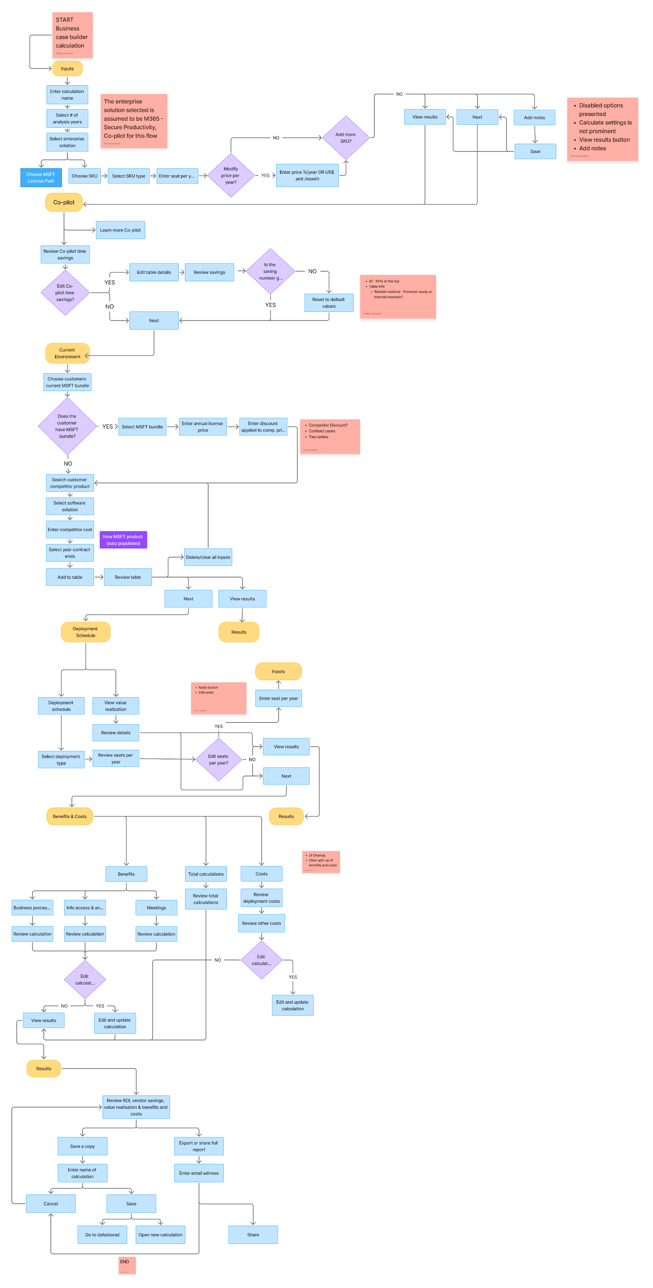
Visualizing the Workflow: Flowcharting the MDM Experience
I conducted a hands-on walkthrough, testing each step of the calculation process, and created a detailed flowchart to identify roadblocks.
USER STORIES
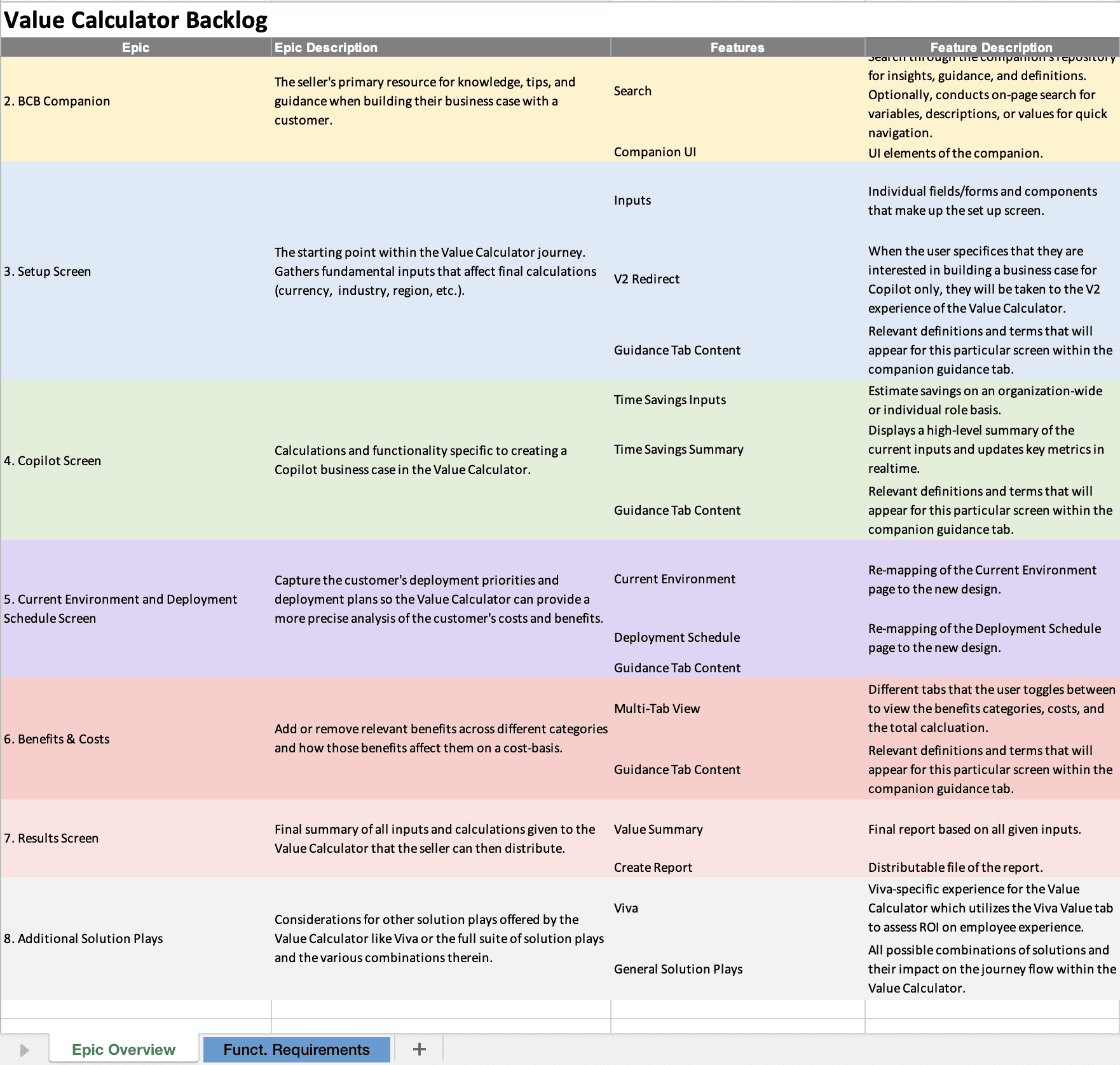
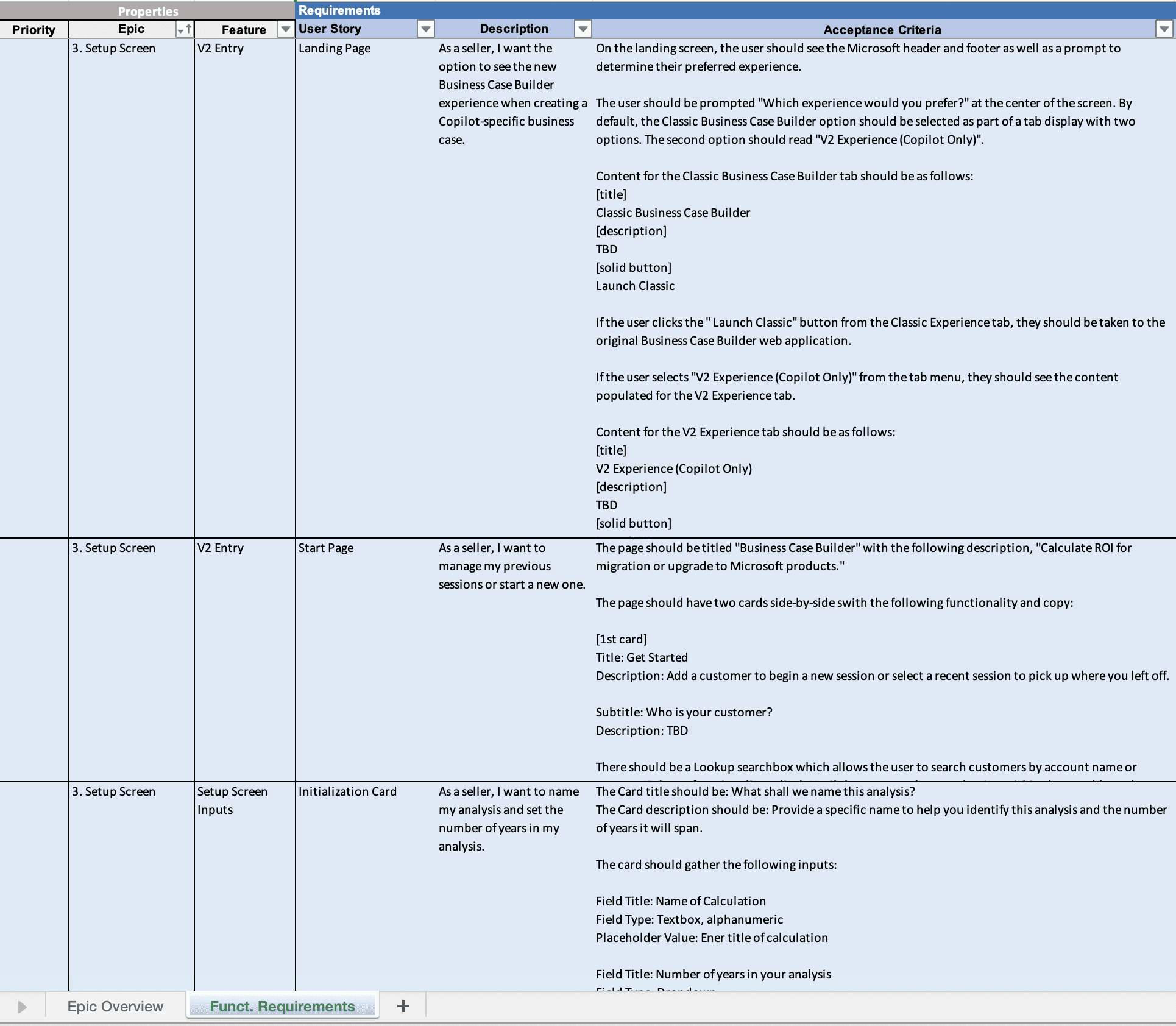
Capturing User Stories Aligned with Business Goals
I collaborated closely with the Product Manager to define and capture essential user stories for the Business Case Builder redesign
DESIGN SOLUTION
Designing and Refining the Wireframes for the Platform
After prioritizing the legacy platform’s process flow and user stories, I transitioned into wire-framing and ideating key screens for the redesigned experience
First Iteration Design: An Experience Similar to Turbotax
Approach
Each core task receives its own screen and the user progresses through each of them one at a time. The side bar is modified to include the sub-steps for ease of navigation between
Pros
Each screen is extremely focused and simplified
Each step assigned its own screen allows for more space for each input
More space = more opportunities for manipulating whitespace = minimalist designs
Cons
As this tool supports a complex workflow, users often like to refer back and forth which is hard when everything is separated.
Lose contextual information of the piece vs. the whole
Second Iteration Design: An Experience Based on Progressive Disclosure
Approach
The user starts with what is minimal and as they complete each step the next step is appended to the end of the previous one.
Pros
Everything is progressively disclosed, which increases focus
Users are provided additional action and context once the previous is complete
The latest action is always in the user’s view, though they can scroll upwards to see the history
Context is strongly maintained
Cons
If the user is adding a lot of licenses or SKUs, the tab could grow to be quite long
Users cannot see what is coming up next, they must proceed with each step at a time
Third Iteration Design: An Experience that Shows Everything
Approach
This experience shows ‘everything’ up front to the user without having to interact.
Pros
Users get transparent line of sight into the next actions that are required of them.
Users are able to navigate with complete freedom throughout the page to complete the information in any order
Power users and frequent users may prefer this flexible and straightforward approach
Cons
For new users, it could be too much information at once and therefore not as structured of an experience that they may need
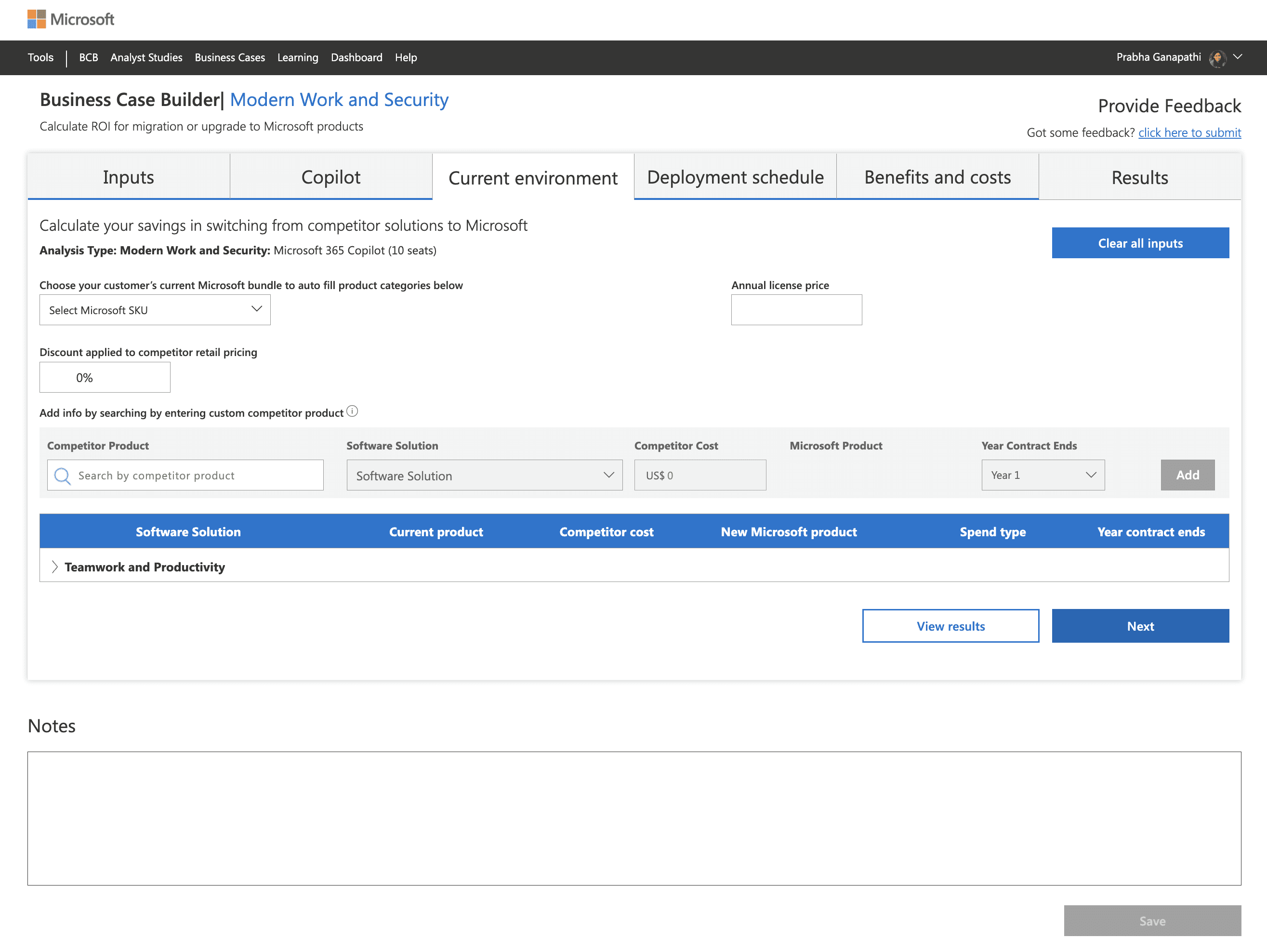
SELECTED DESIGN APPROACH: ITERATION 2
After discussions with users and key stakeholders, we selected Option 2: the progressive disclosure model for the experience. This approach allowed users to begin with minimal input and gradually uncover the next step only after completing the current one.
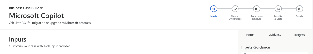
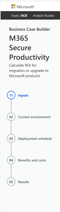
NAVIGATION
Redesigning Navigation to Support Step-by-Step ROI Calculations
We designed multiple iterations of the navigation bar to provide users with a clear sense of progress throughout the ROI calculation process. The updated navigation helps users understand where they are, what step comes next, and how far along they are in building their business case reducing confusion and improving task completion rates.
Navigation of the Legacy Platform
New Iterations We Created
First Iteration
Built on the first version but introduced enhanced UI styling, better clarity, and faster decision-making
Second Iteration
Built on the first version but introduced enhanced UI styling, better clarity, and faster decision-making
Third Iteration
Built on the first version but introduced enhanced UI styling, better clarity, and faster decision-making
1
2
3
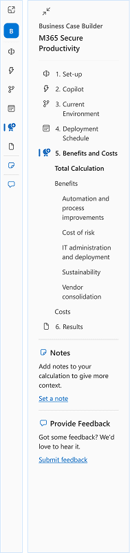
SELECTED DESIGN APPROACH: ITERATION 3
The tabbed and vertical approach gives users enough visual feedback on where the user is on their product selection journey while allowing for enough space on the right for the selection process.
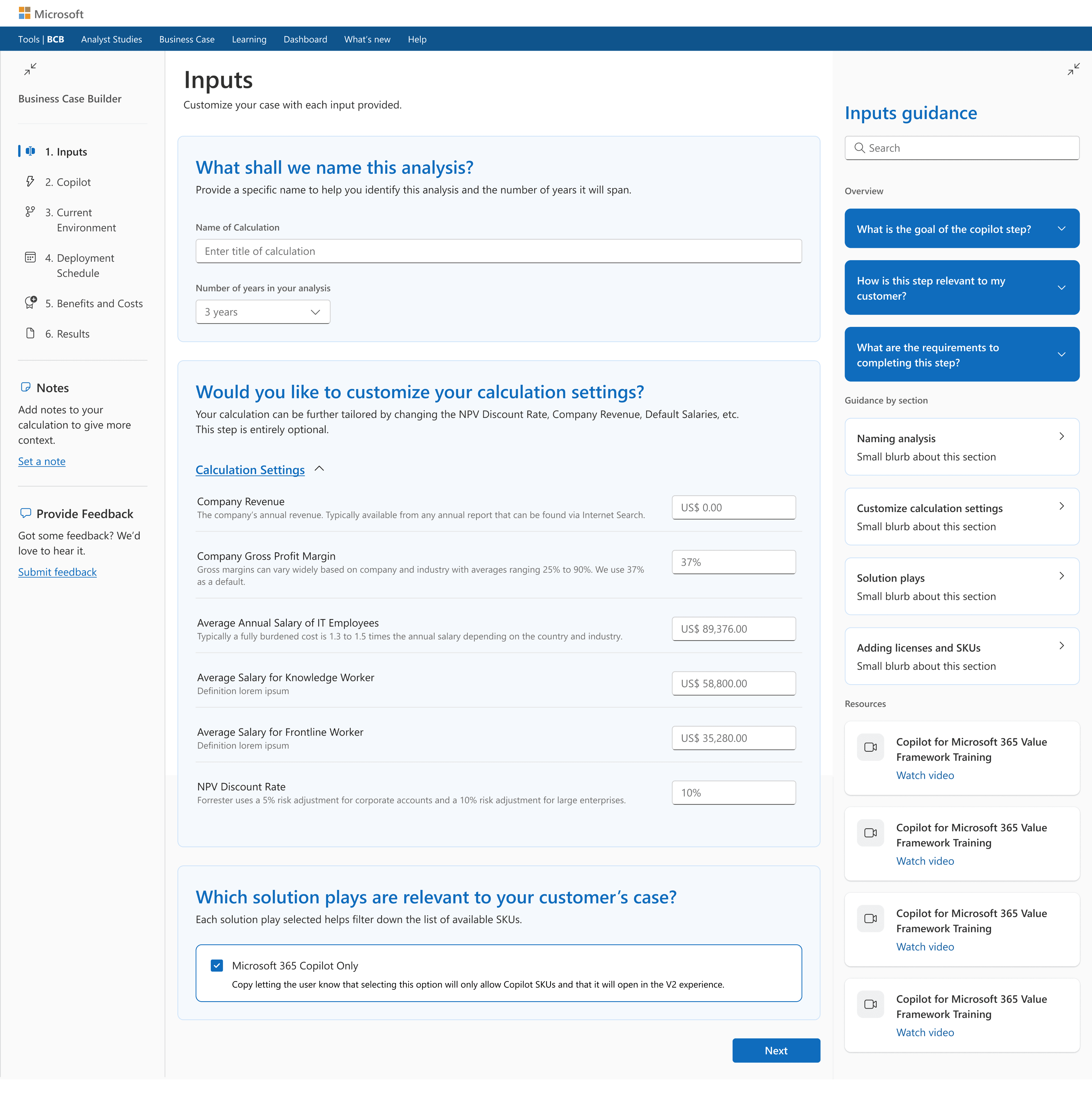
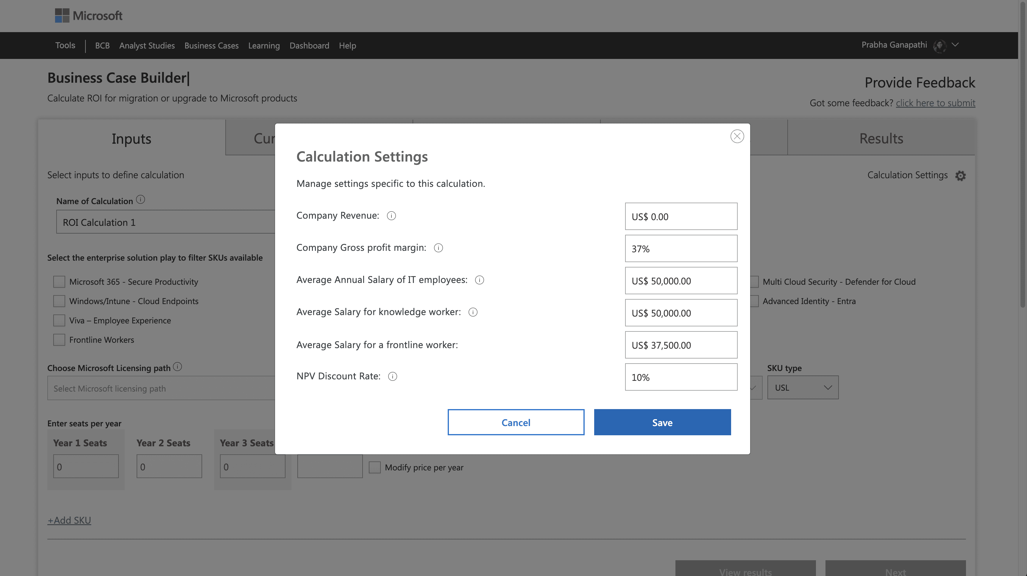
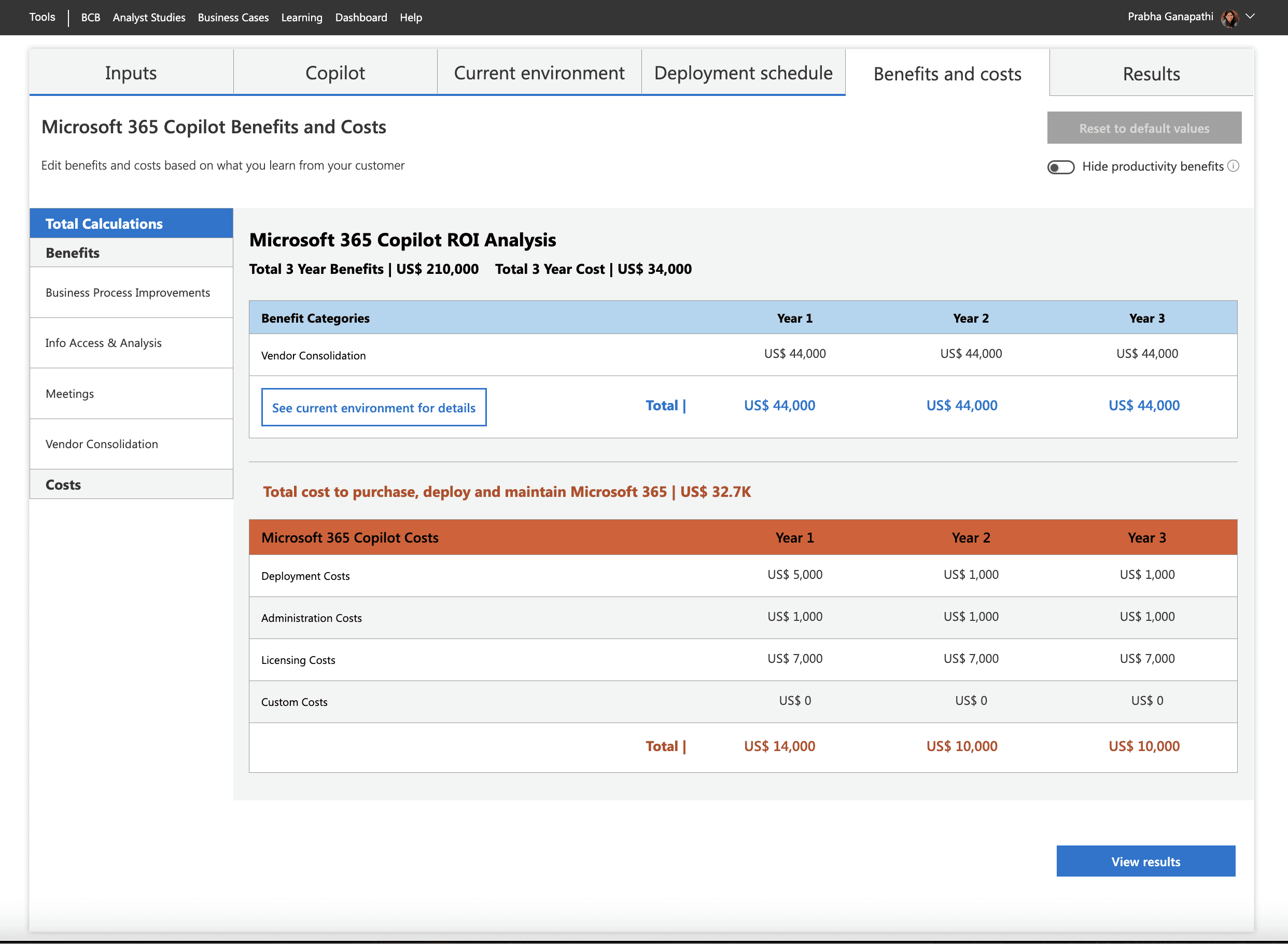
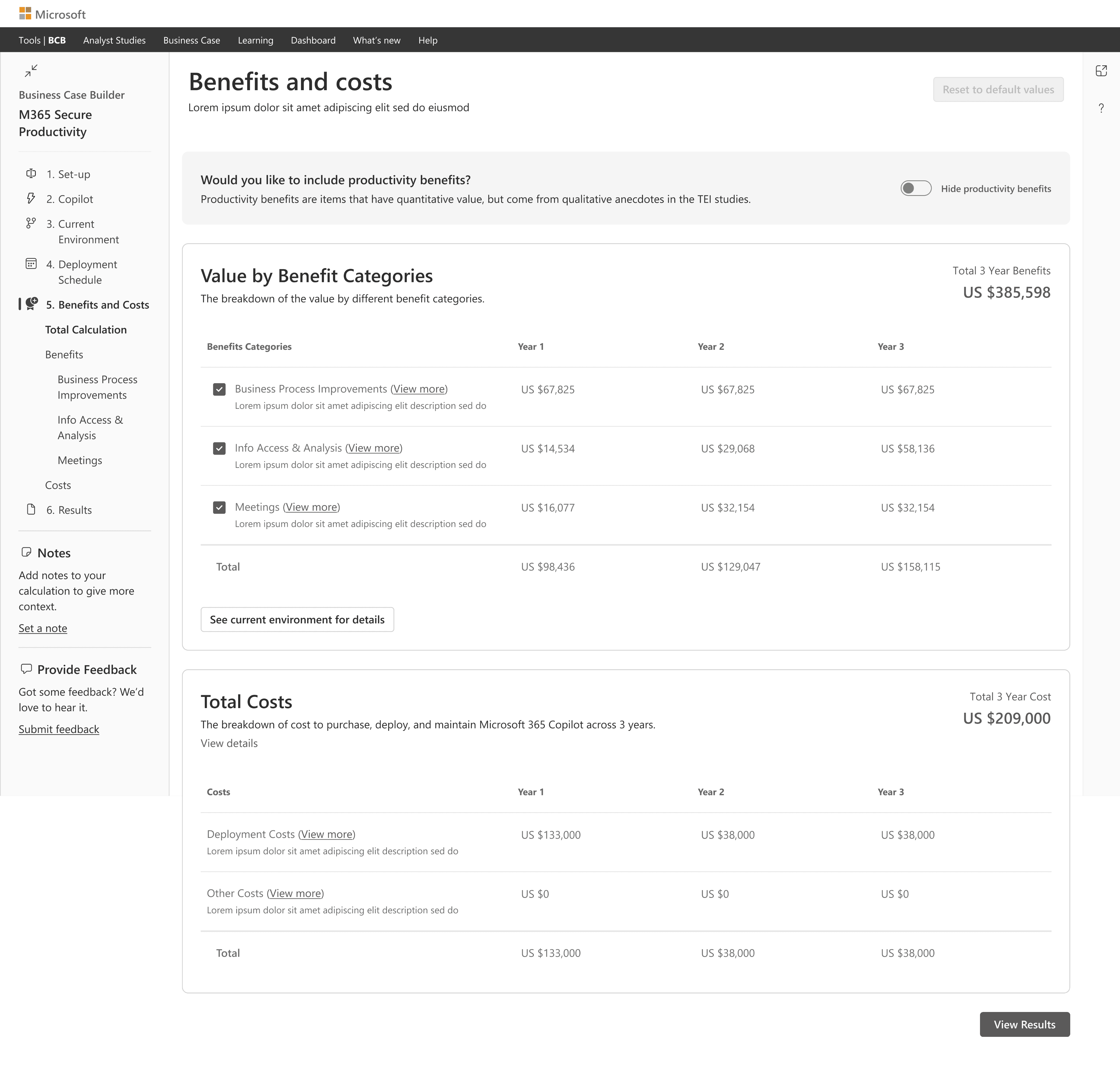
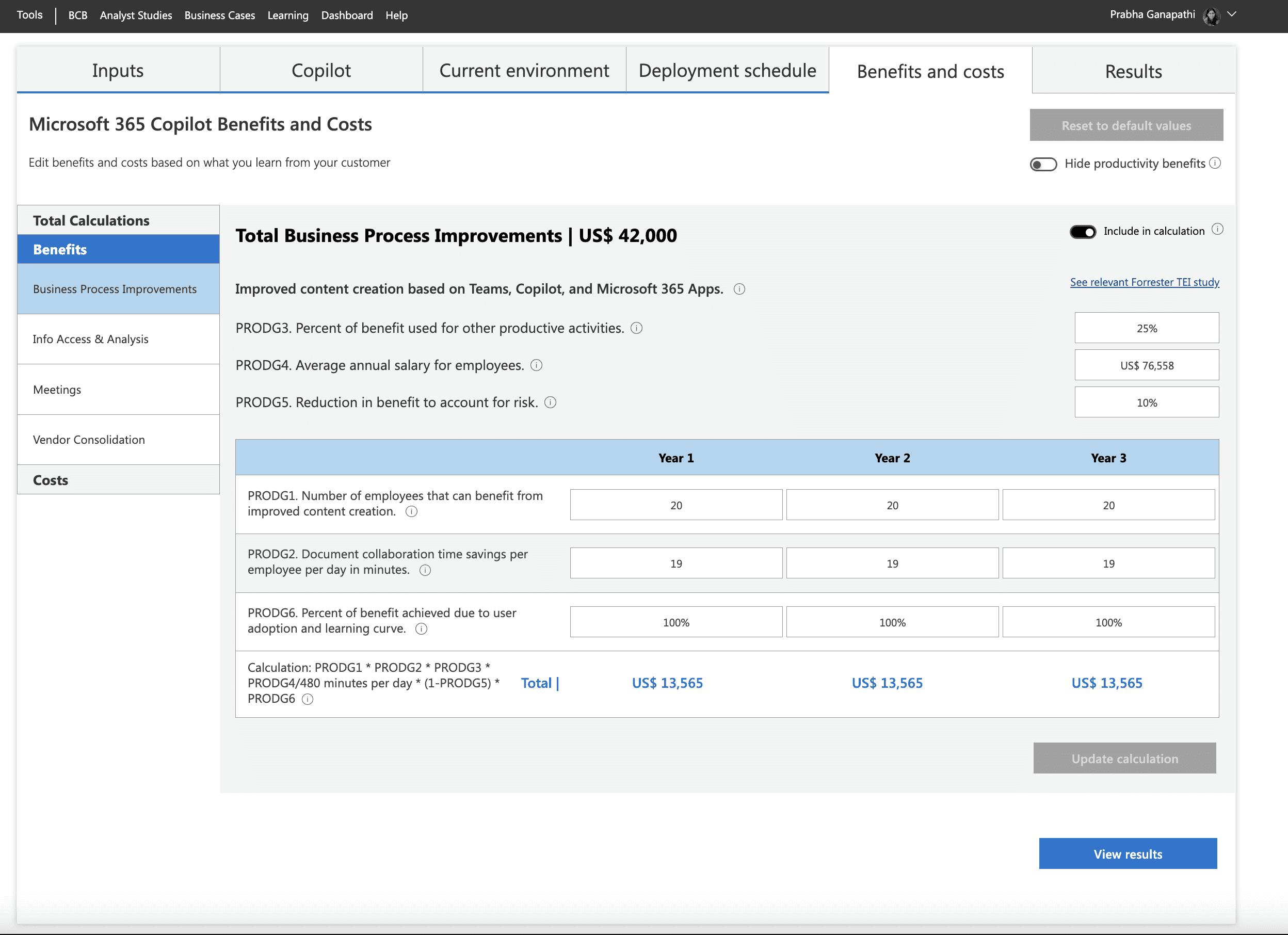
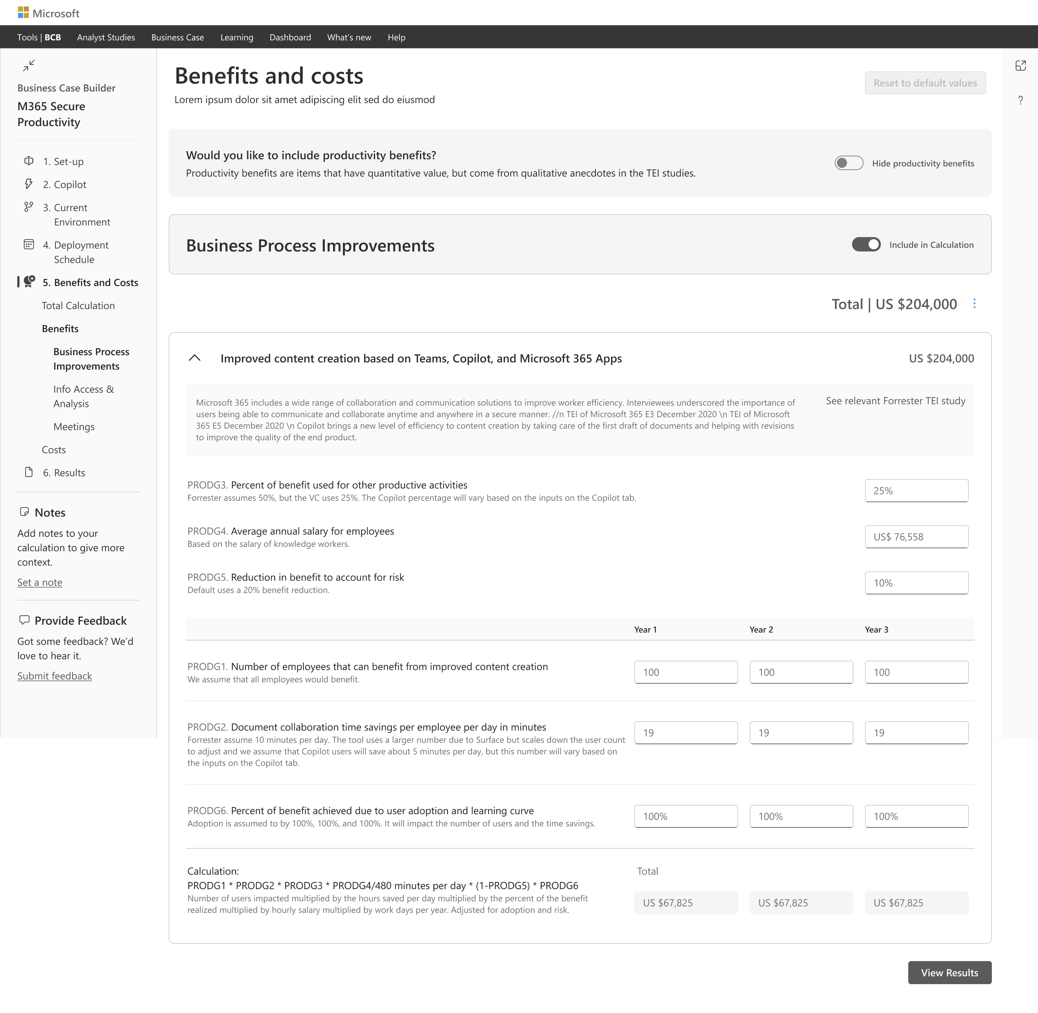
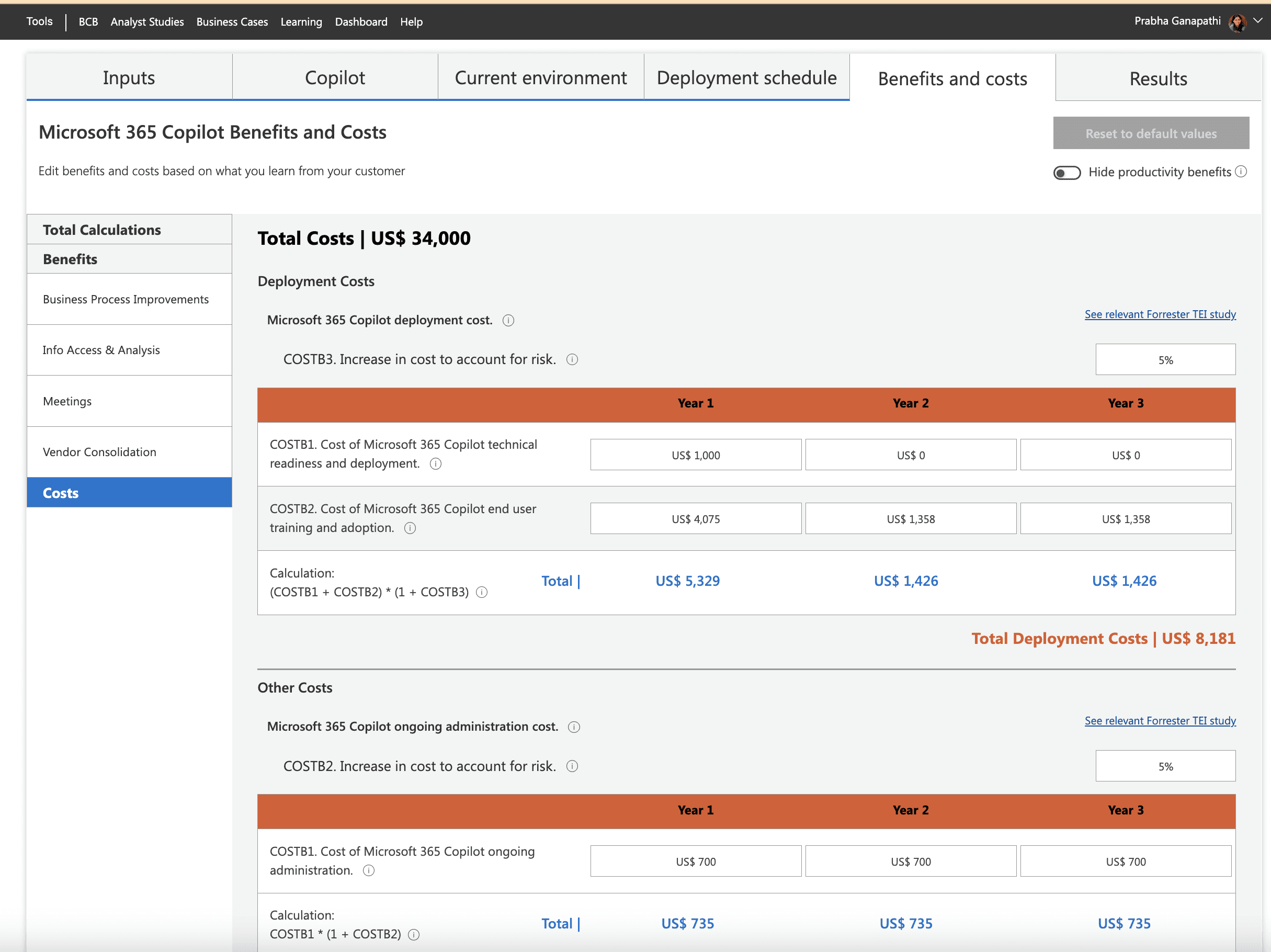
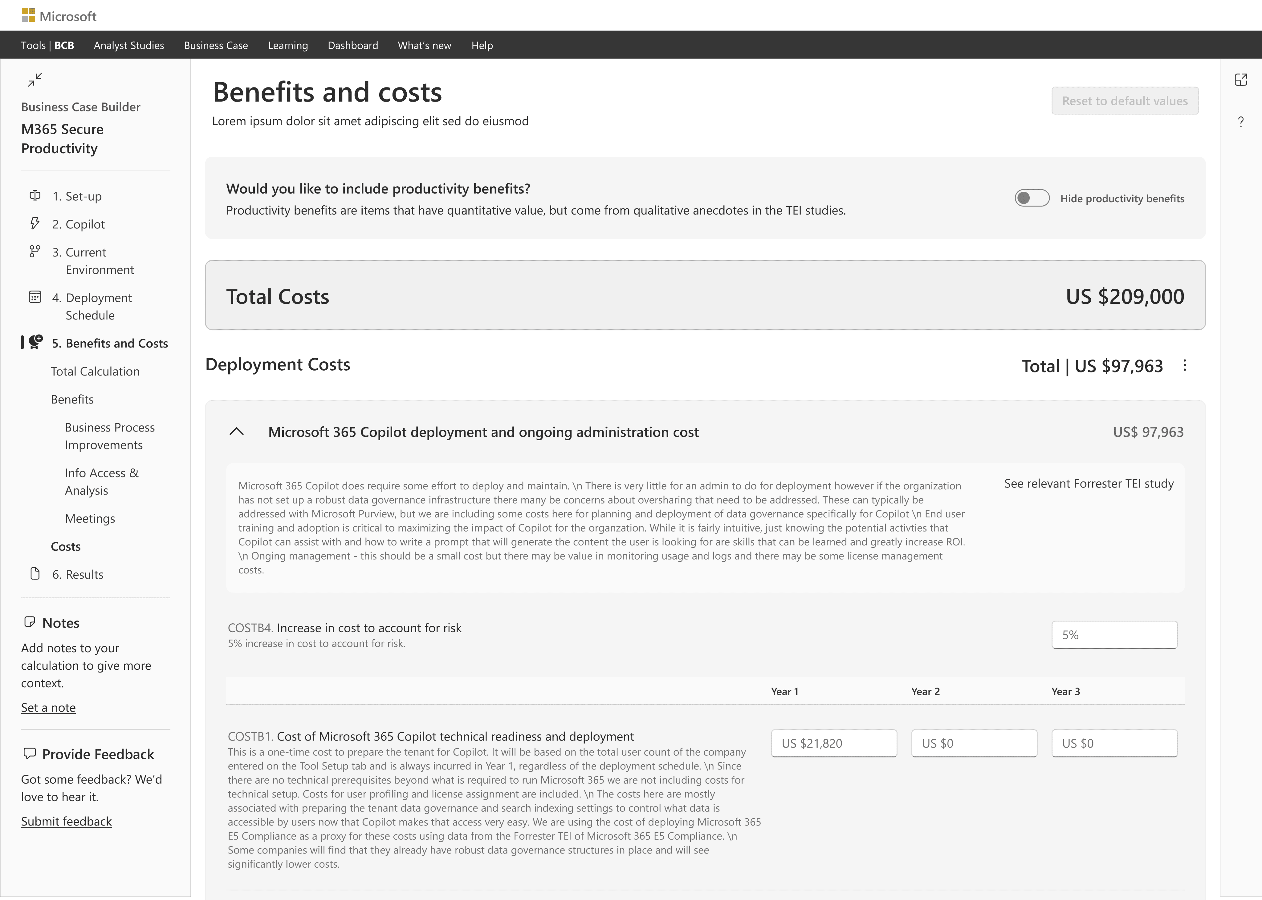
DESIGNING THE BENEFIT & COSTS PAGE
Designing and Refining the Benefit and Costs Page
Users found the original Benefits and Costs page overwhelming due to too much data at once. I redesigned it with collapsible categories, clearer totals, and interactive elements like ‘View More’ links, which made the information more digestible and improved the overall user experience
BEFORE
AFTER
BEFORE
AFTER
BEFORE
AFTER
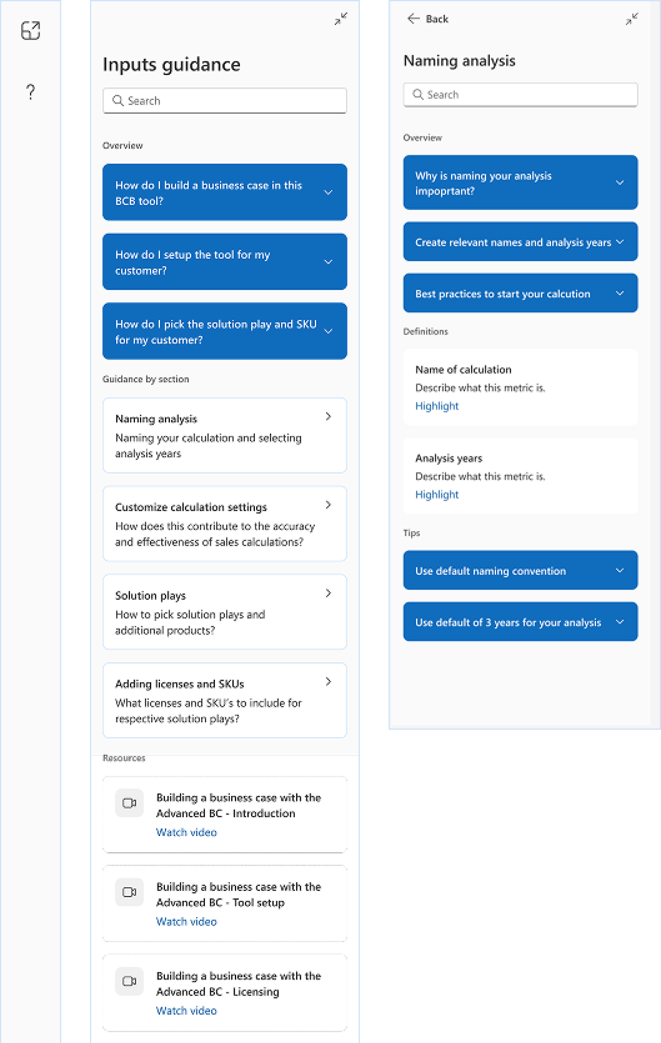
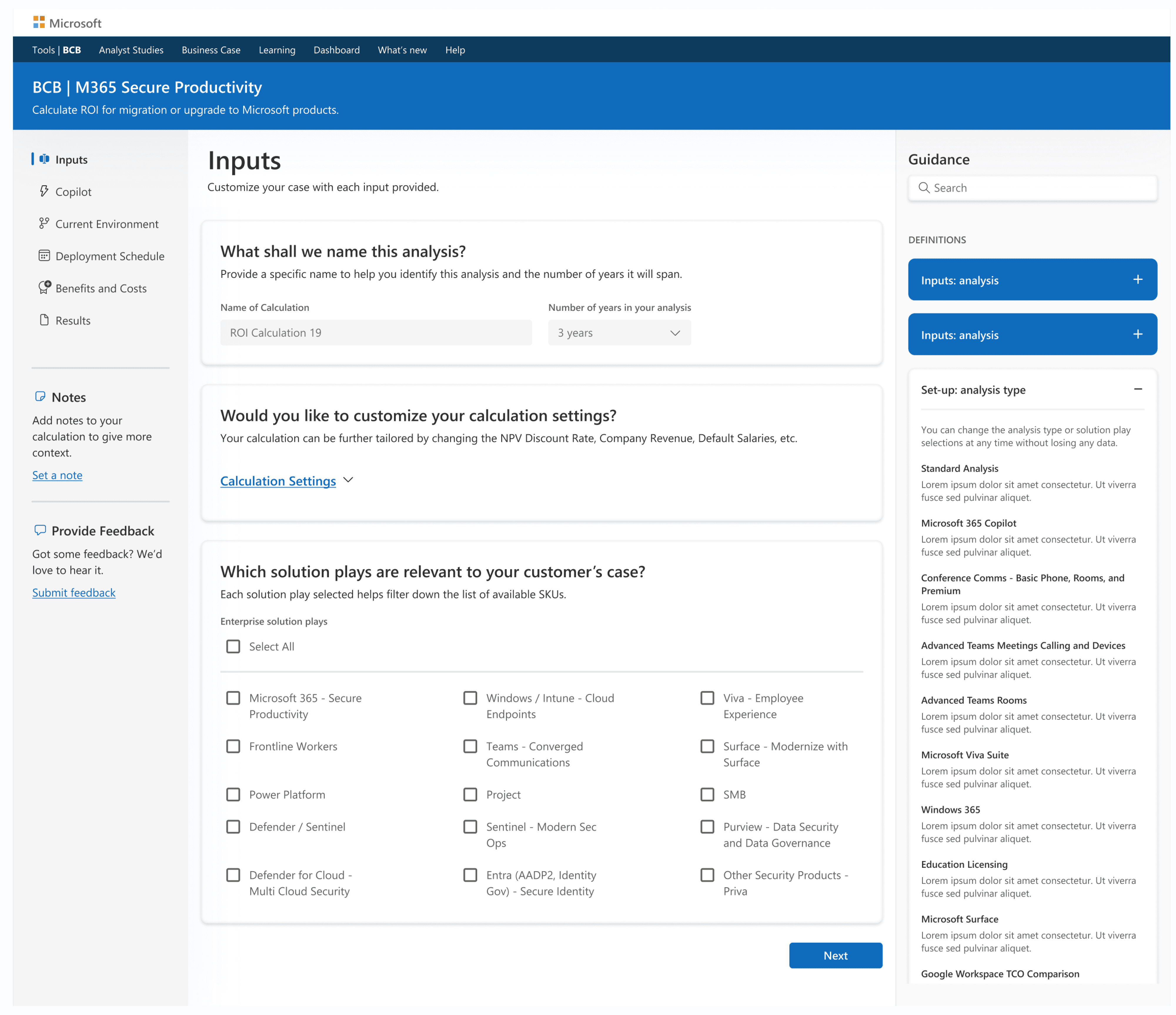
GUIDANCE PANEL
Introducing a Smart Guidance Panel for In-the-Moment Help
To support users as they navigate complex ROI inputs, I designed a right-side guidance panel that offers quick access to definitions, tooltips, resources, and explanations for specific terms. This contextual help system enhances user confidence, reduces dependency on external documentation, and improves task efficiency.
VISUAL DESIGN
Crafting Visual Design with Flexibility and Consistency Using Fluent 2
First Option - Conservative Style
A clean, traditional look that prioritizes clarity and familiarity. It’s safe and easy to use, but visually similar to other enterprise tools—offering limited distinction.
Second Option - Moderate Style
A balanced design that combines usability with visual appeal. Key content areas are highlighted using light blue card backgrounds, and darker blue buttons make calls-to-action stand out without overwhelming the layout.
Third Option - Next-Gen Style
A bold, modern approach inspired by Fluent 2 and Microsoft Copilot. It feels futuristic and innovative but may raise accessibility concerns and might not resonate with all users.
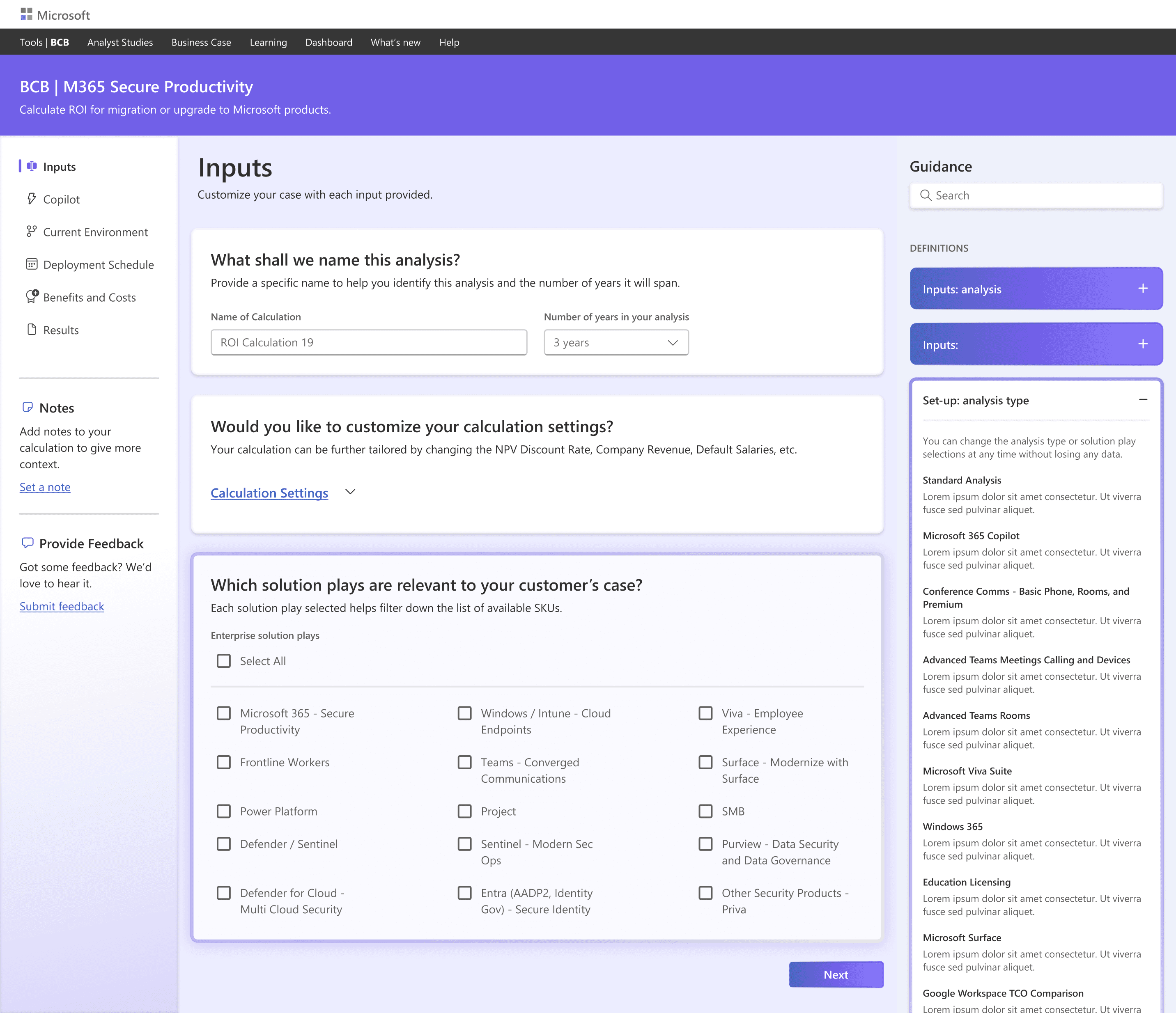
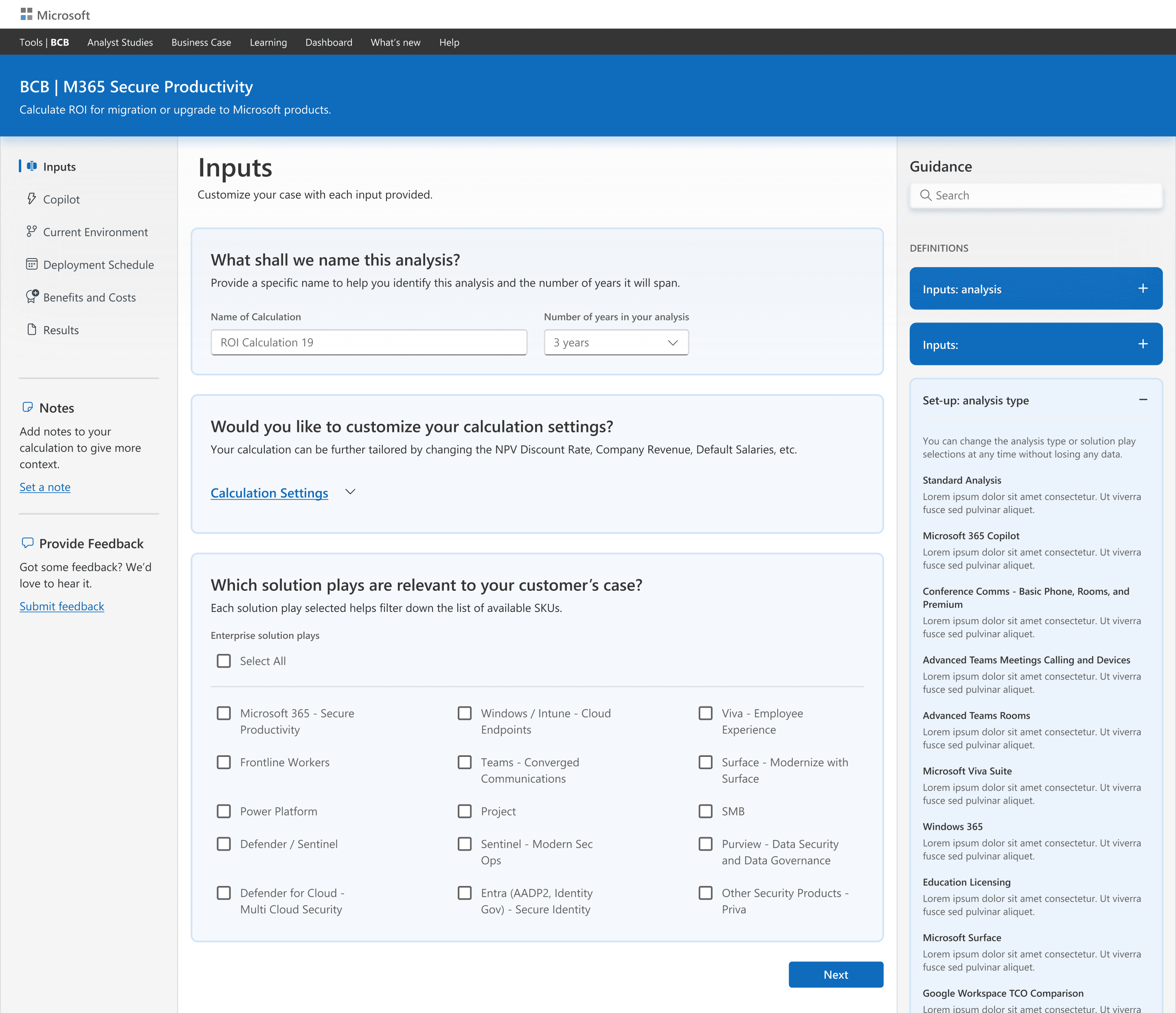
SELECTED DESIGN APPROACH: SECOND OPTION
After talking to users and stakeholders, we chose Second Option because it made the experience feel clearer and easier to follow.
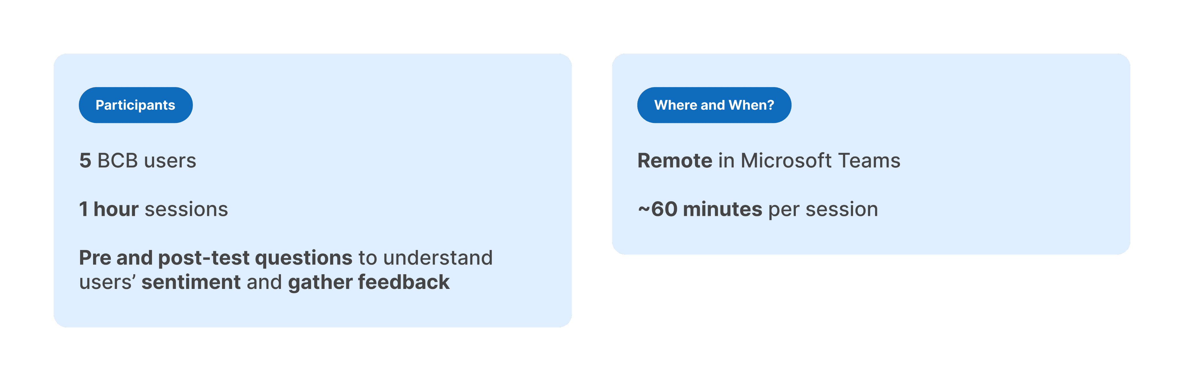
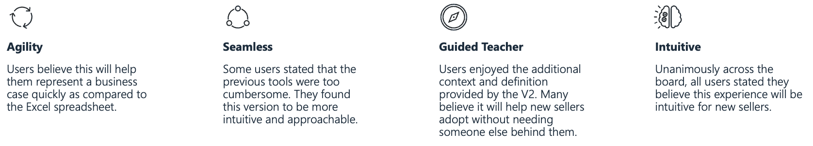
USABILITY TEST
Validating the Design: Usability Testing with Real Users to Measure Clarity, Efficiency, and Confidence
After completing the wireframes and visual mocks, we wanted to validate the design with real users, so we conducted a usability testing session with five participants.
TEST RESULTS
All participants accurately identified duplicate profiles and successfully completed the merge tasks. Only one participant needed help with UI navigation. However, the average time to process each ticket exceeded the target of 1 minute, taking 1m 52s per ticket.
What was the most memorable part of the experience?
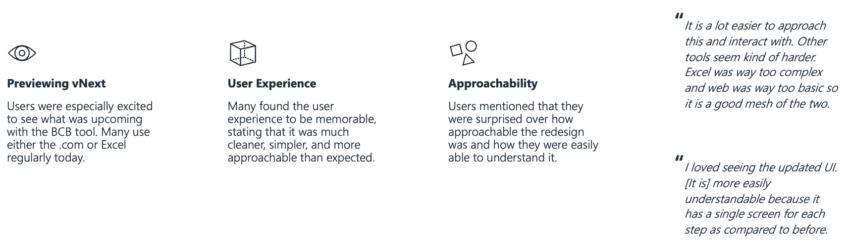
Where did you encounter the most friction?
How do you think this tool will impact your productivity?
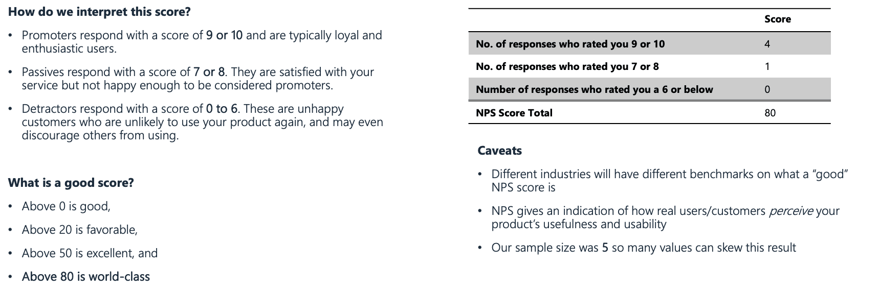
On a scale of 1-10, how likely are you to recommend?
NEXT STEPS
Driving Adoption, Efficiency, and Business Value
Phase one delivered a streamlined UI that replaced manual spreadsheets, improved data entry, and enhanced variance tracking. Within the first quarter, tool adoption rose, users reported faster workflows, and sales teams created quicker, data-backed proposals.