Teladoc Health Master Data Management System (MDM)
I designed a Data Management Platform to manage incoming consumer profiles from clinics, hospitals, and pharmacies. My work focused on creating an intuitive interface and streamlined workflow to handle complex data integration

OVERVIEW
Designed a Master Data Management Platform to Dedupe and Unify Patient Records
Master Data Management (MDM) is a system that ensures each consumer has a single, accurate profile by unifying data from various sources.
I designed Teladoc’s internal MDM platform to help data stewards manage incoming consumer profiles from clinics, hospitals, and pharmacies. While simple cases are handled automatically, the platform supports manual review of complex cases allowing users to compare records, resolve duplicates, and take actions like merge, split, update, or deactivate profiles under a unique Global ID.
MY ROLE
Lead UX Designer – End-to-End MDM Platform Design
I was responsible for managing the end-to-end design process of the MDM platform. I collaborated closely with stakeholders to understand the platform’s goals and user needs. In addition to this I worked as a Product Owner for the last 3 months working closely with the developers and managing the sprint process.
MY ROLE
Initial Research
Wireframes
Visual Mocks
Usability Testing
Dev Handover
TEAM
3 Project Manager’s
(from different work-streams)
2 Architects
3 Developer
1 Tester
1 Designer (myself)
TOOLS
Figma
Jira
Confluence
TIMELINE
8 months
OUR CHALLENGE
Design an intuitive UI that helps Data Stewards accurately and efficiently resolve duplicate consumer profiles from multiple healthcare sources
Teladoc needed a dedicated platform to support manual resolution of consumer profiles that couldn’t be auto-processed. The challenge involved enabling users to confidently compare, merge, split, or deactivate records while minimizing errors and maintaining data integrity at scale.
PROBLEM STATEMENT
Teladoc’s automated system lacked the capability to efficiently resolve complex duplicate consumer profiles, creating the need for an intuitive UI that empowers data stewards to confidently manage and reconcile records across multiple healthcare sources
PROCESS
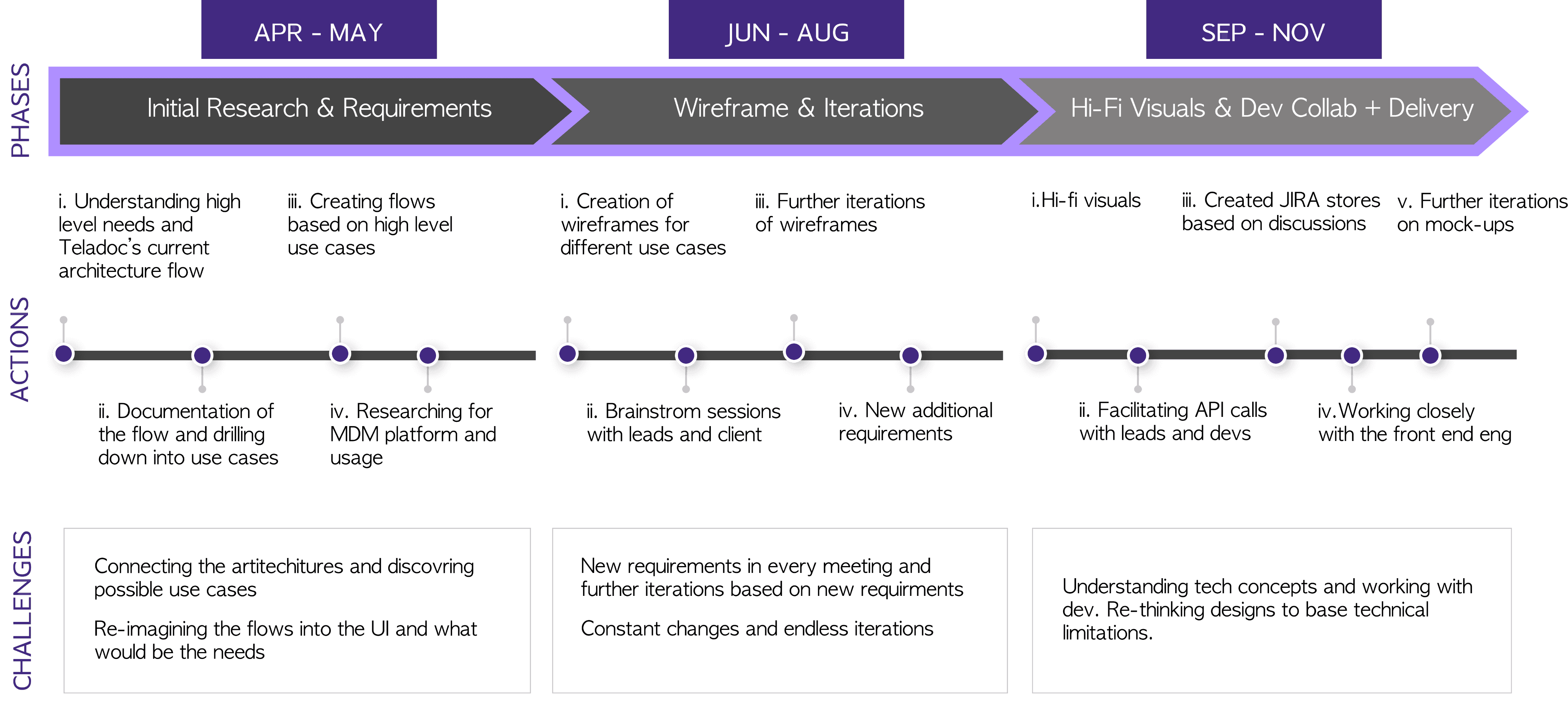
Owned discovery through delivery in an accelerated
8-week timeline
The first two months were dedicated to initial research and requirements gathering to understand Teladoc's internal structure. Once the key use cases were defined, we moved into wireframe iterations. Through multiple brainstorming sessions, we refined the designs and collaborated closely with the development team to drive the solution through to delivery.
USER RESEARCH
Getting to Know the System: How Teladoc Manages Consumer Data Through Global ID, Profiles, and Lifetime Accounts
I started by learning how Teladoc’s backend systems worked and what the team was aiming to build. I worked closely with PMs, architects, and developers to understand the overall plan and how the data platform would support it. The platform was built around three main capabilities.
1
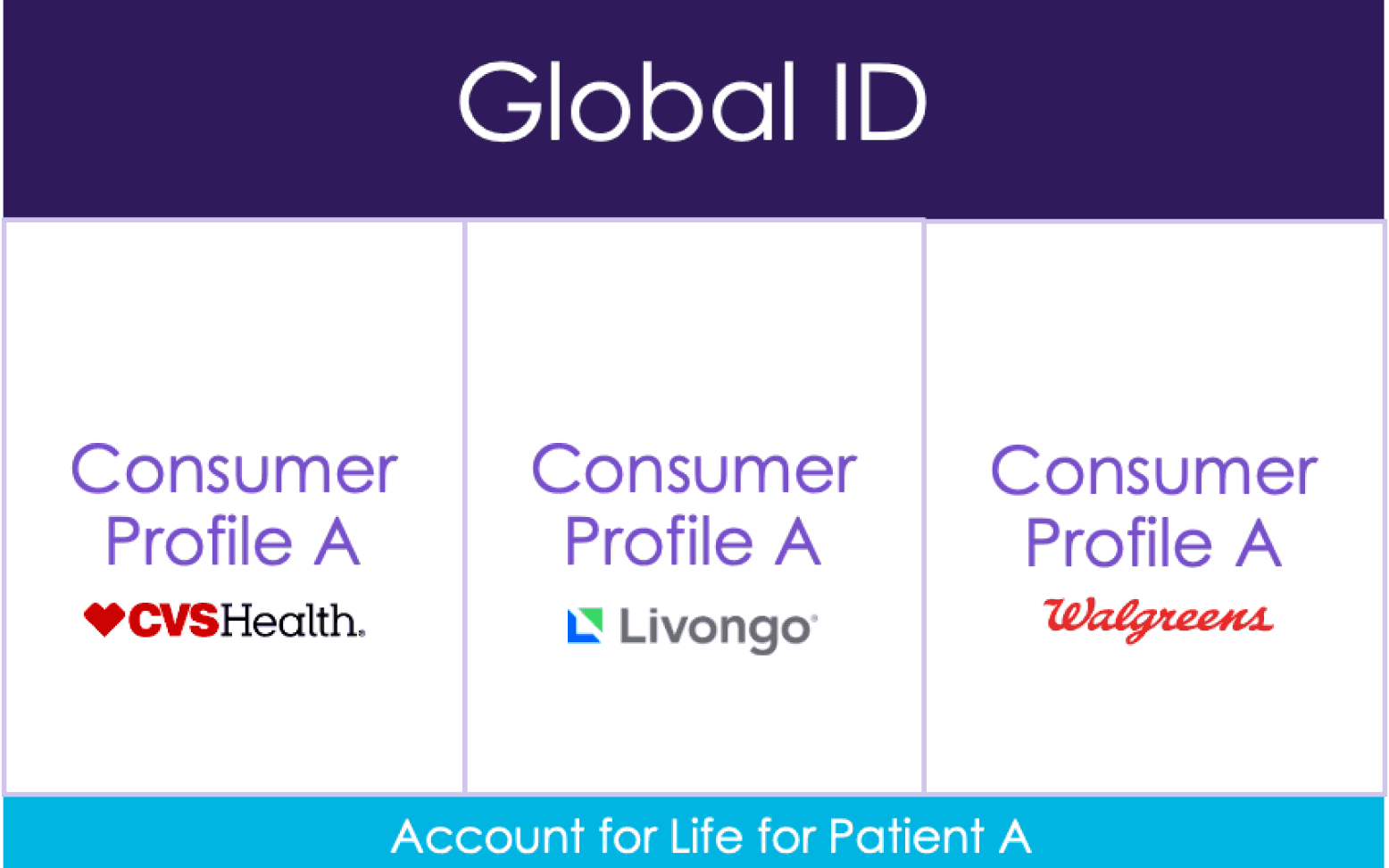
Global ID: A Global ID would systematically assign one unique ID to each consumer based on demographic matches.
2
Global Profile: A Global Profile would house the most accurate demographic and preference data for each consumer.
3
Account for Life: An Account for Life would enable consumers to access Teladoc services seamlessly across their lifetime.
USE CASES
Translating Needs into Use Cases: What Data Stewards Really Need to Do?
After understanding the system, I started identifying the core use cases the platform needed to support. Through several working sessions with the product team, we finalized the key actions that data stewards should be able to perform.
MERGE
Combining duplicate consumer profiles into a single, unified record to maintain one accurate profile per consumer.
DE-MERGE
Separating consumer profiles that were previously merged incorrectly, restoring them as distinct records.
UPDATE
Updating a consumer’s demographic information, which can be triggered by users through the Teladoc OneApp or by contacting customer support.
DE-ACTIVATE/RE-ACTIVATE
Temporarily pausing or reactivating a consumer profile, often due to issues like non-payment.
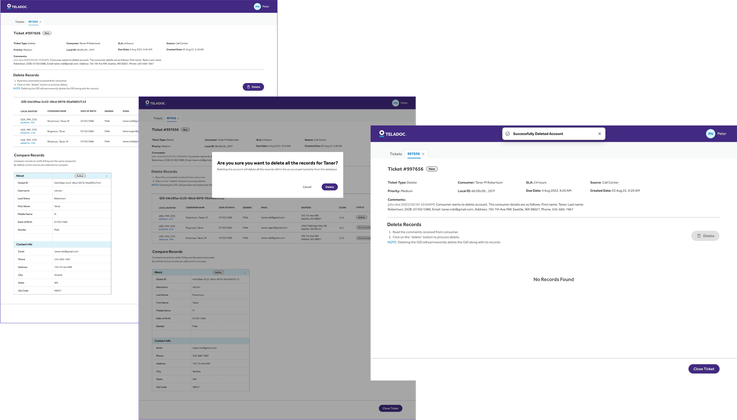
DELETE
Permanently removing a consumer’s account and associated profile data from the system.
KEY GUIDING PRINCIPLES
Key Product Goals That Shaped the Experience
The goal of the platform was to help data stewards resolve complex profile issues quickly, accurately, and at scale. Thus, we came up with these three guiding principles:
1
Minimize Average Handling Time: Target less than 2 minute per case
2
Support Confident Decisions: Show clear, side-by-side data comparisons
3
Design for Scalability: Create a flexible interface for growing needs
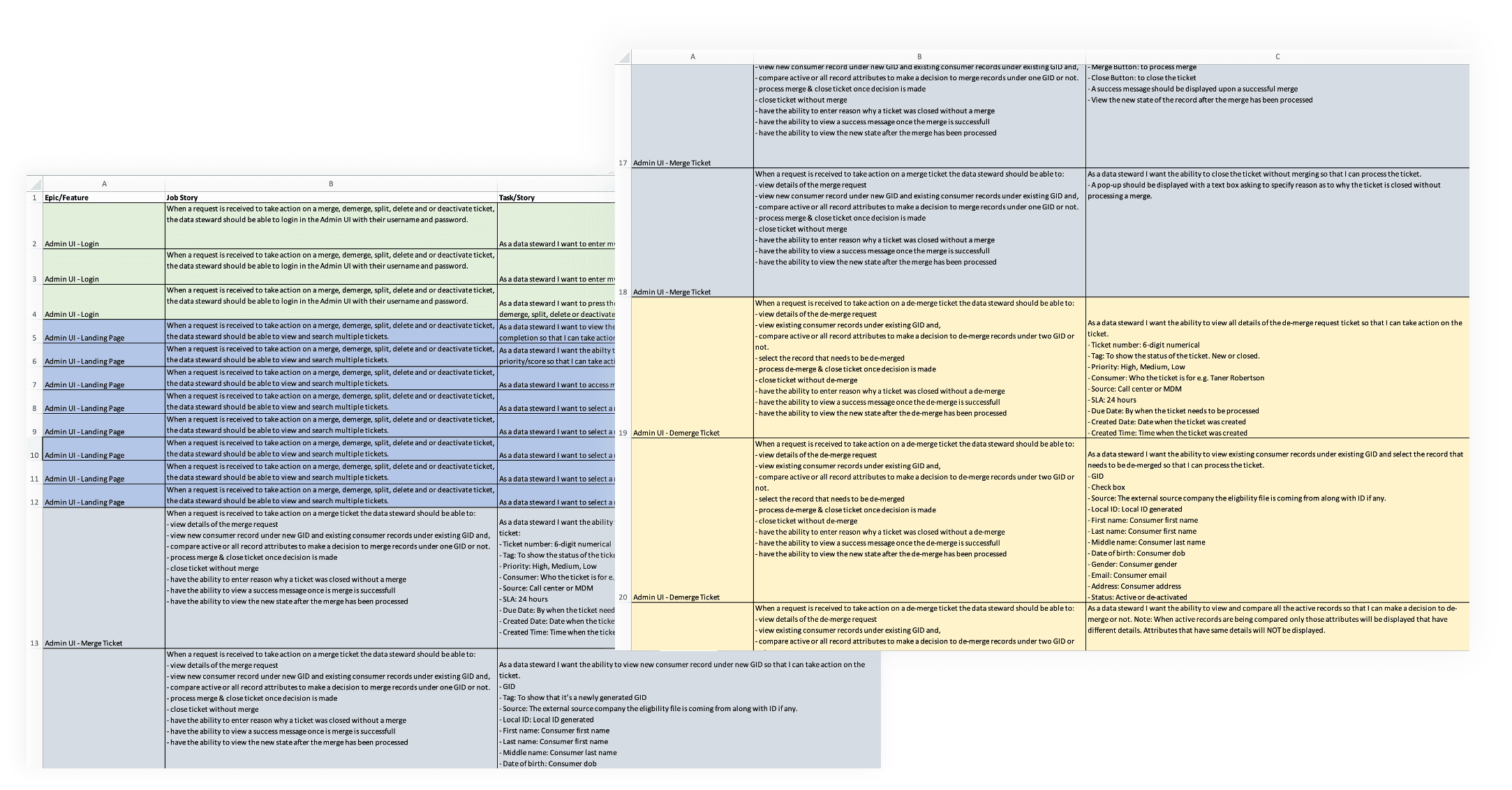
USER STORIES
Turning Use Cases into Actionable User Stories
I created detailed user stories to capture core functionality starting with Excel for early planning and cross-functional alignment, then organizing and managing them in Jira to support the development process and ensure smooth execution.
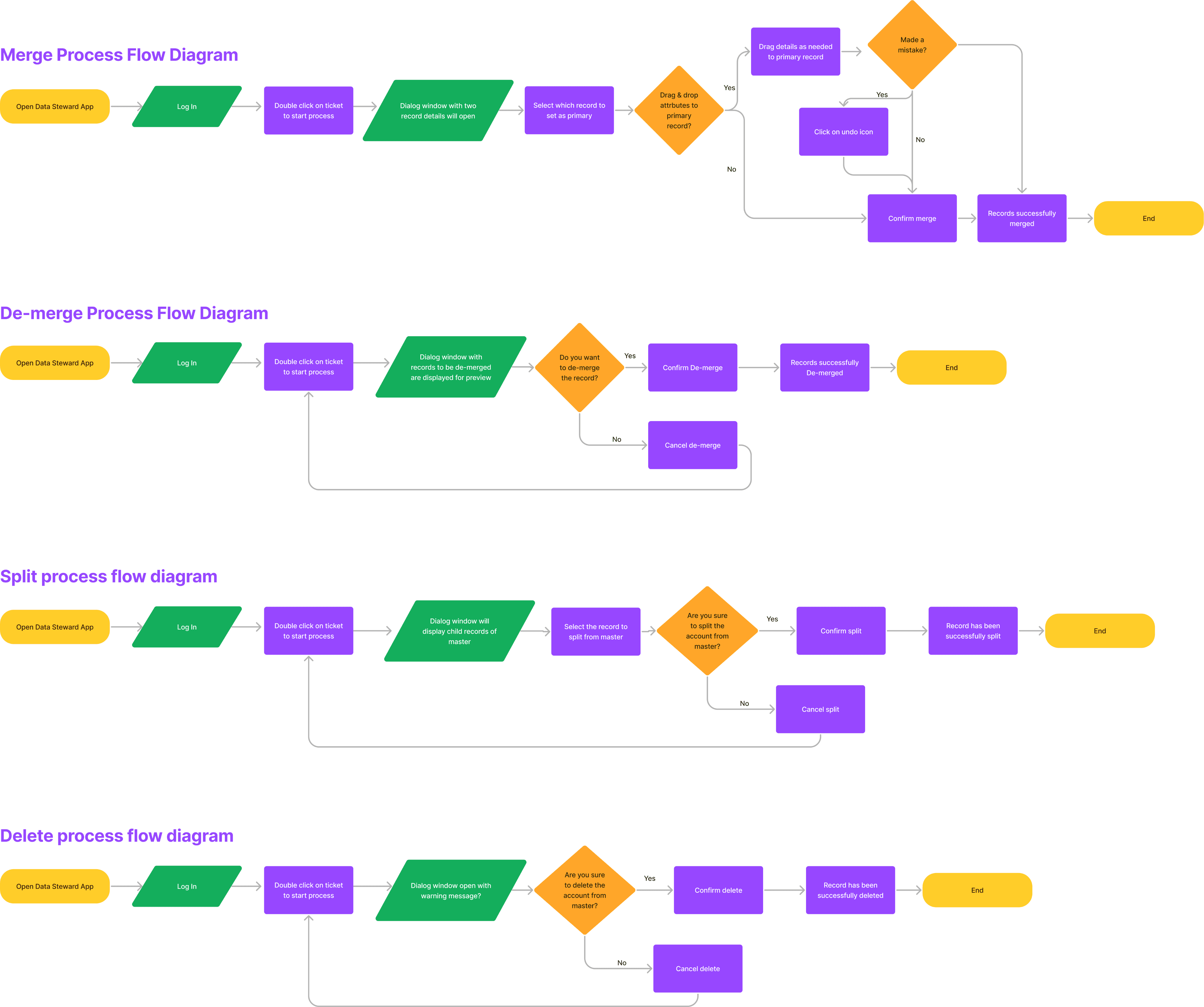
USER FLOW
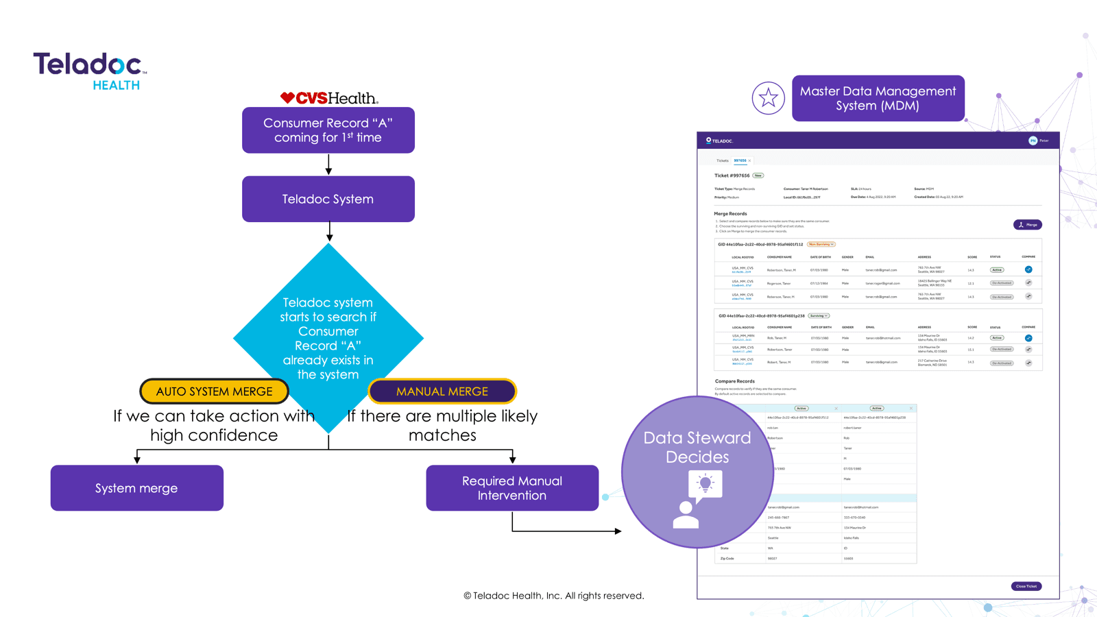
Visualizing the Workflow: Flowcharting the MDM Experience
I designed a detailed flowchart for the MDM portal to clearly visualize key workflows and decision points. This helped align the team on how the platform operates end-to-end, ensuring clarity across product, design, and engineering.
DESIGN SOLUTION
Designing and Refining the wireframes for the Merge Experience
I began designing high-level wireframes for the primary workflow: the merge flow. I created several iterations and collaborated with key stakeholders to refine the design through brainstorming sessions.
First Iteration Design: Master Record Approach
Approach
Each ticket had a master record, and users could pick valid attributes from different profiles.
Challenges
Information overload
Difficult selection process
Time-consuming workflow
Second Iteration Design: Master Record Approach
Approach
Built on the first version but introduced enhanced UI styling, better clarity, and faster decision-making
Challenges
Partial Time Savings
Information Overload
New Learning - Record Preservation
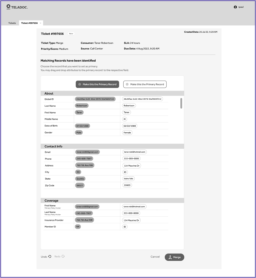
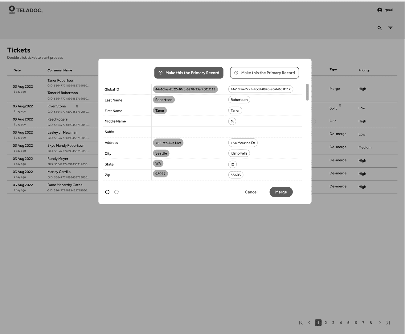
Third Iteration Design: One Click Resolution
Approach
This approach focuses on efficiency and quick decision-making by allowing users to take action with minimal clicks.
Challenges
Limited Access to Ticket
Poor UX Pattern
Space Constraints for Comparisons
CHANGE IN REQUIREMENTS
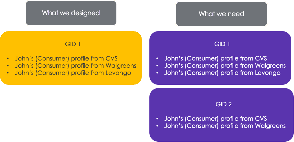
Redefining the Merge: From Combining Records to Linking Them
While iterating on the wireframes for the merge flow, we encountered a significant shift in requirements—the "merge" action wouldn't combine records into a single profile as initially assumed. Instead, it would link multiple records belonging to the same consumer while maintaining their individual source identities. This required rethinking the entire workflow to support linkage logic, ensure data traceability, and align with backend system constraints.
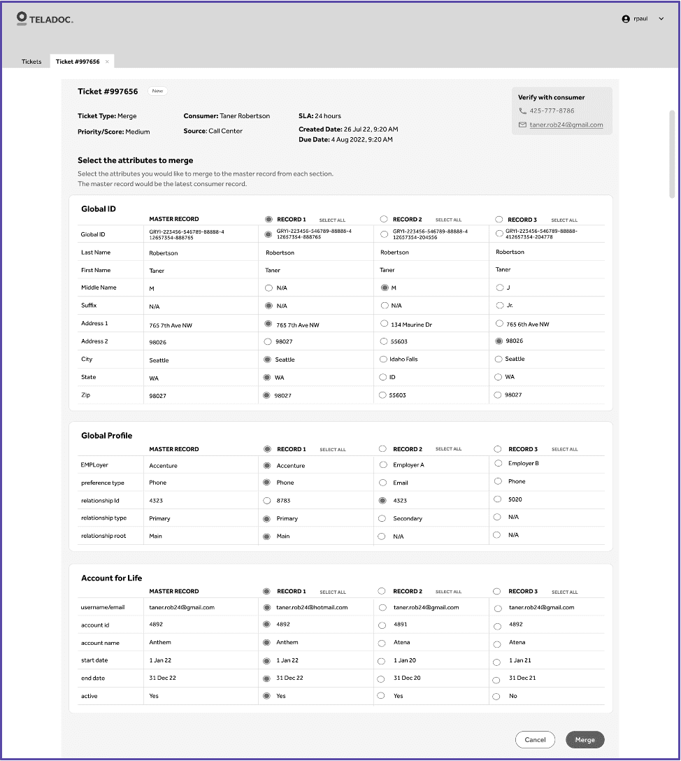
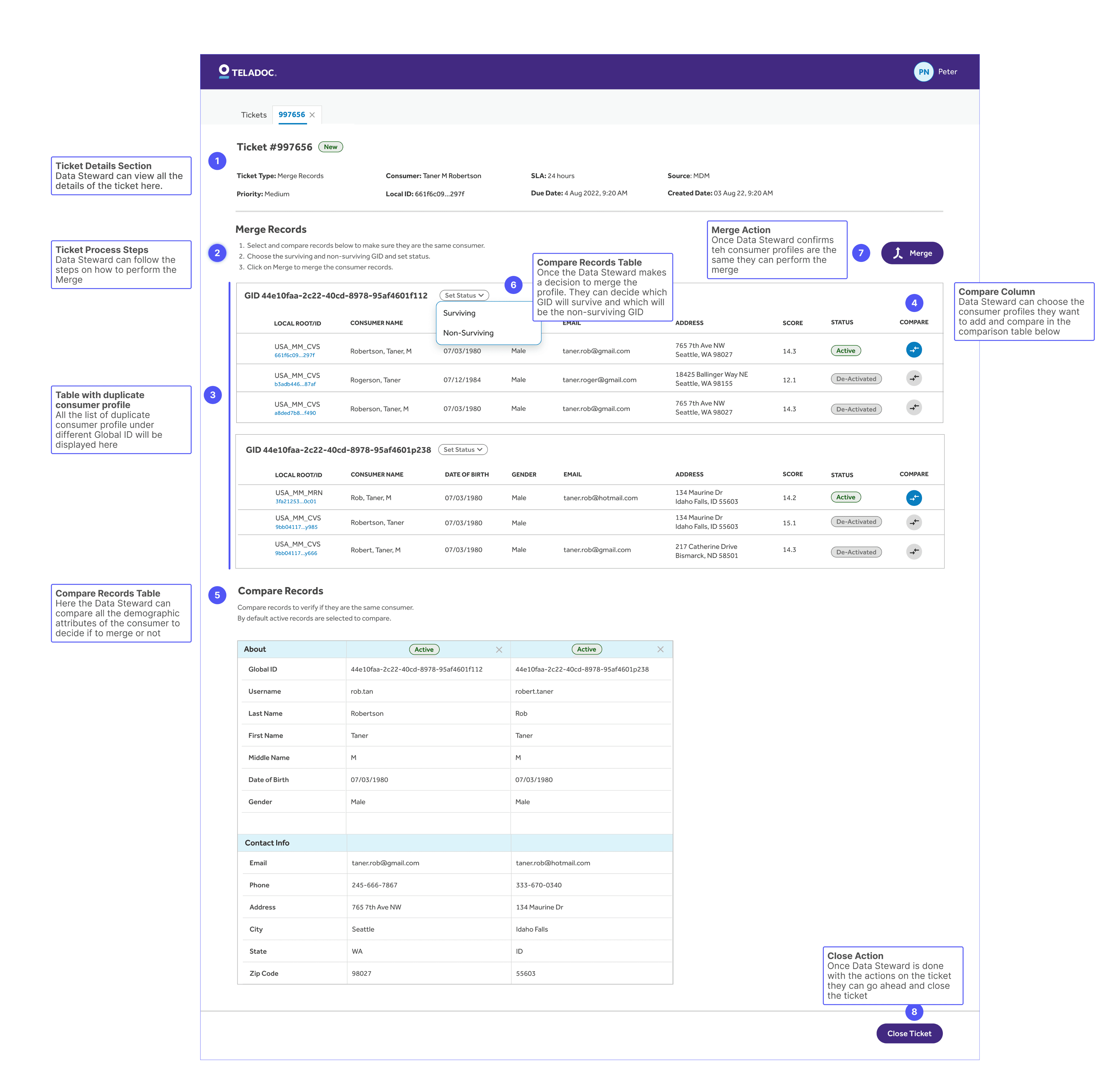
FINAL MERGE DESIGN
Finalizing the Merge Flow to Reflect Linked Records, Not Unified Ones
To address the updated definition of "merge," we redesigned the workflow to reflect the new logic of linking records instead of unifying them. The final design incorporated all necessary functionality, user needs, and backend constraints—ensuring clarity, confidence, and accuracy for data stewards performing merge actions.
FINAL MOCKS
Bringing It All Together: Final High-Fidelity Designs for All Key Use Cases
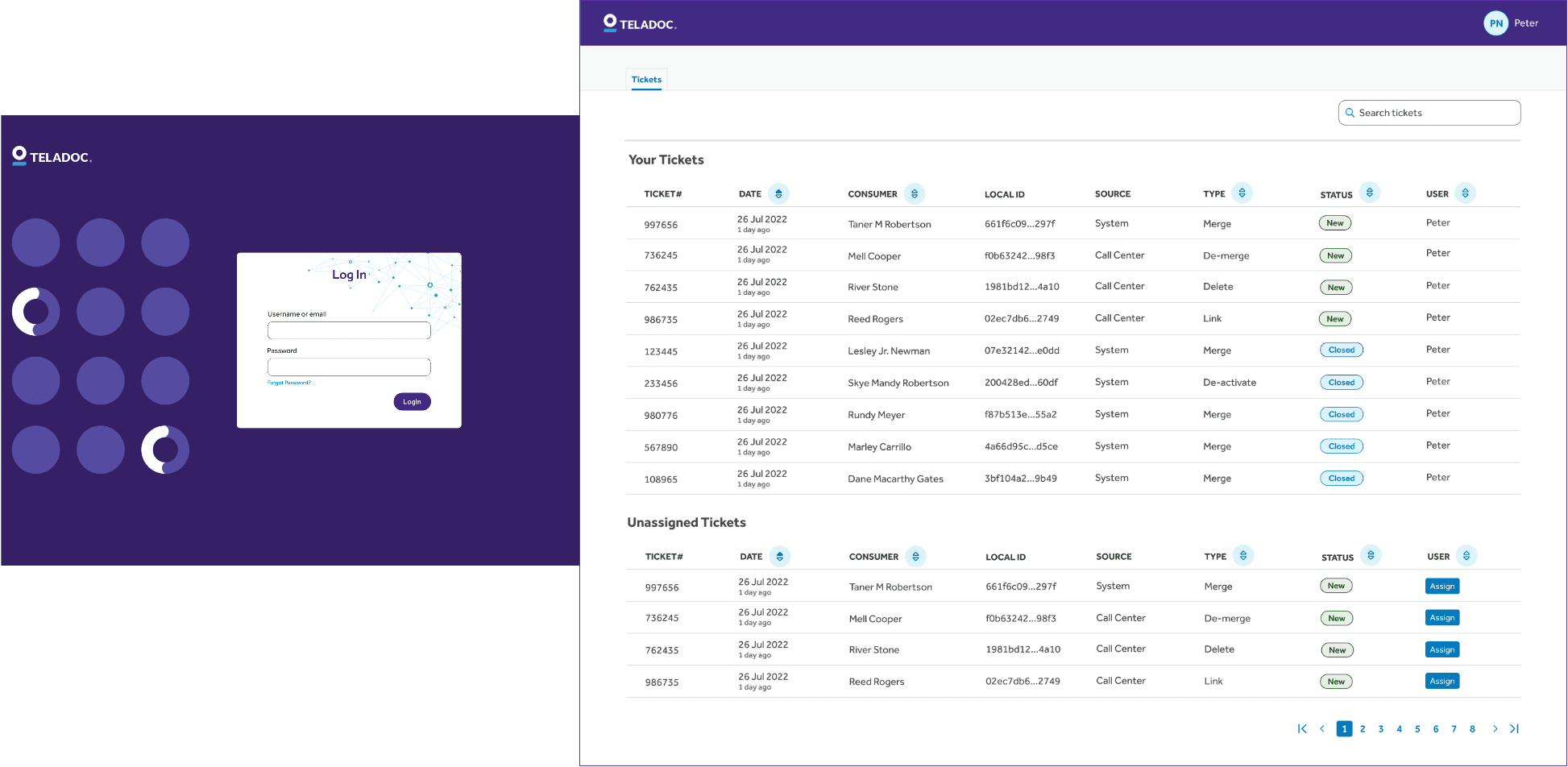
LOGIN & LANDING PAGE
The landing page displays a list of open and closed tickets for all use cases, allowing the Data Steward to efficiently manage and process tickets one after the other.
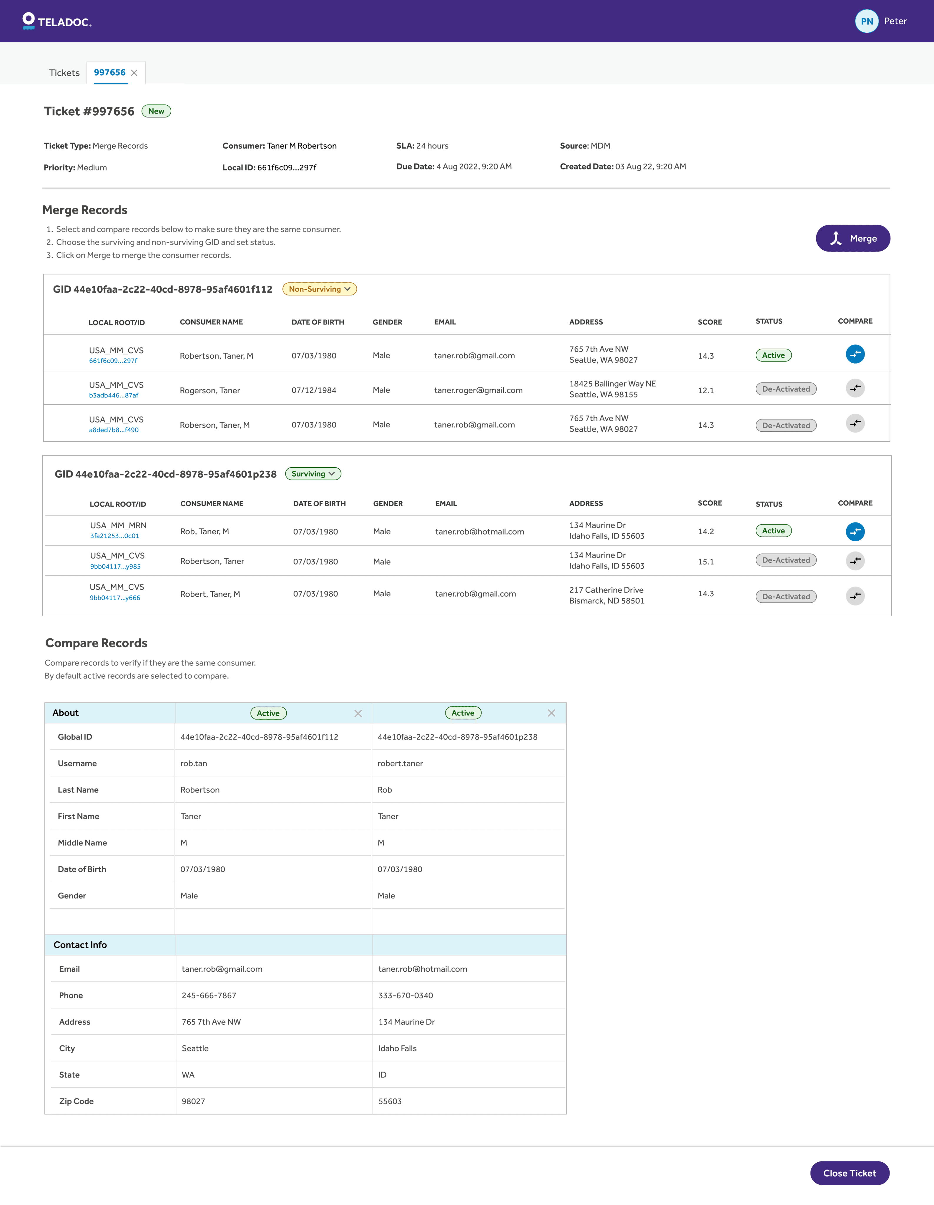
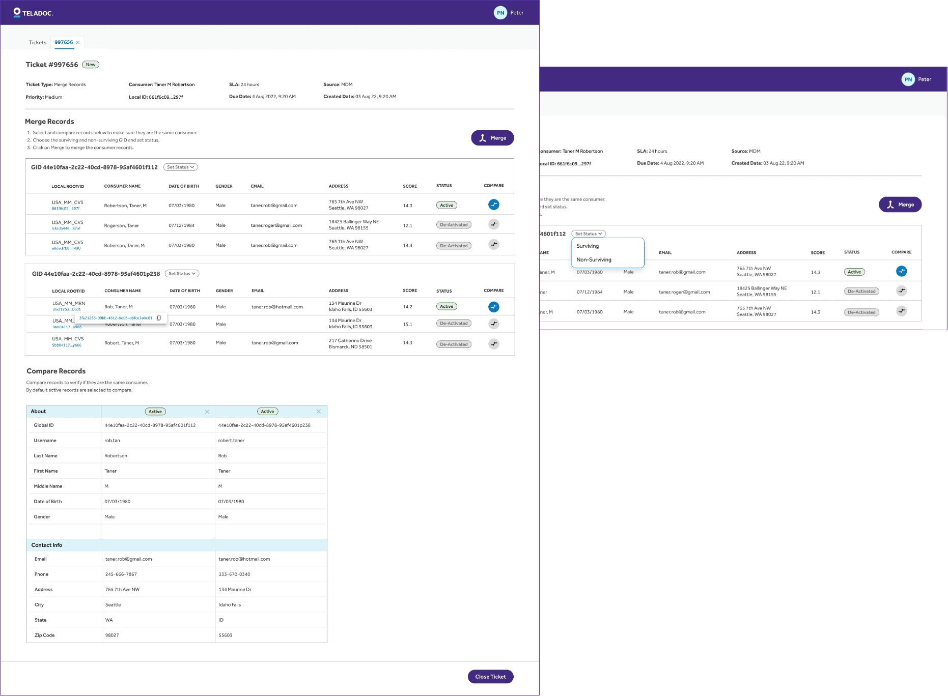
MERGE PAGE
The Merge Page enables Data Stewards to efficiently compare and merge consumer profiles. Ticket details are displayed upfront, followed by guided steps and a structured table for selecting and comparing records.
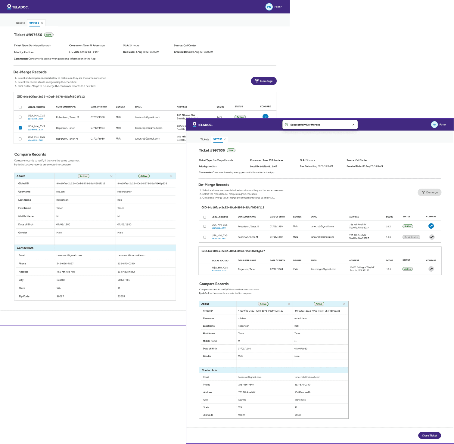
DE-MERGE PAGE
The De-Merge Page allows Data Stewards to review and separate consumer records. Users can select the record to de-merge, which is then assigned a new GID, ensuring accurate data management.
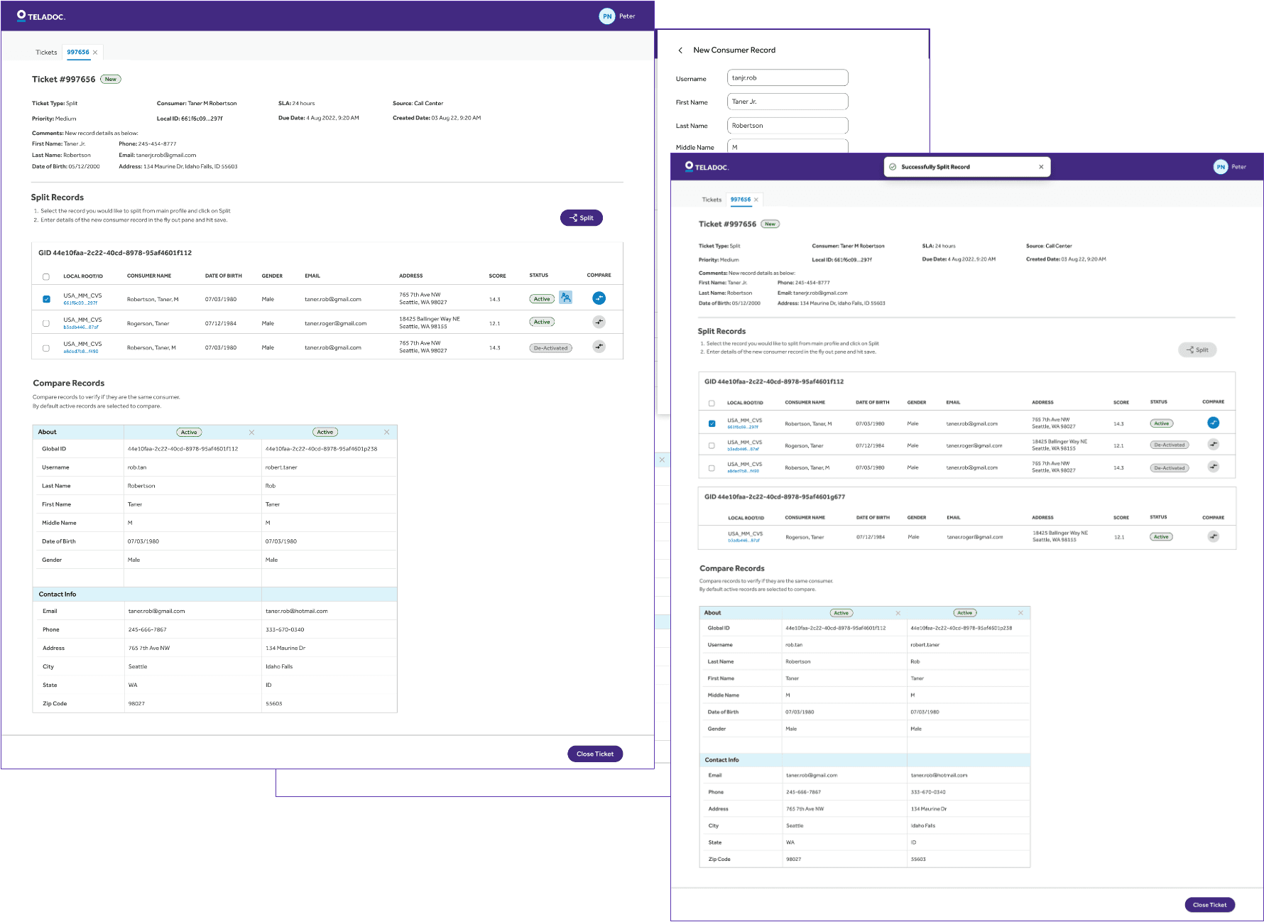
SPLIT PAGE
Split is meant for separating a family member from an existing account to a new separate account by creating a new profile from the existing one.
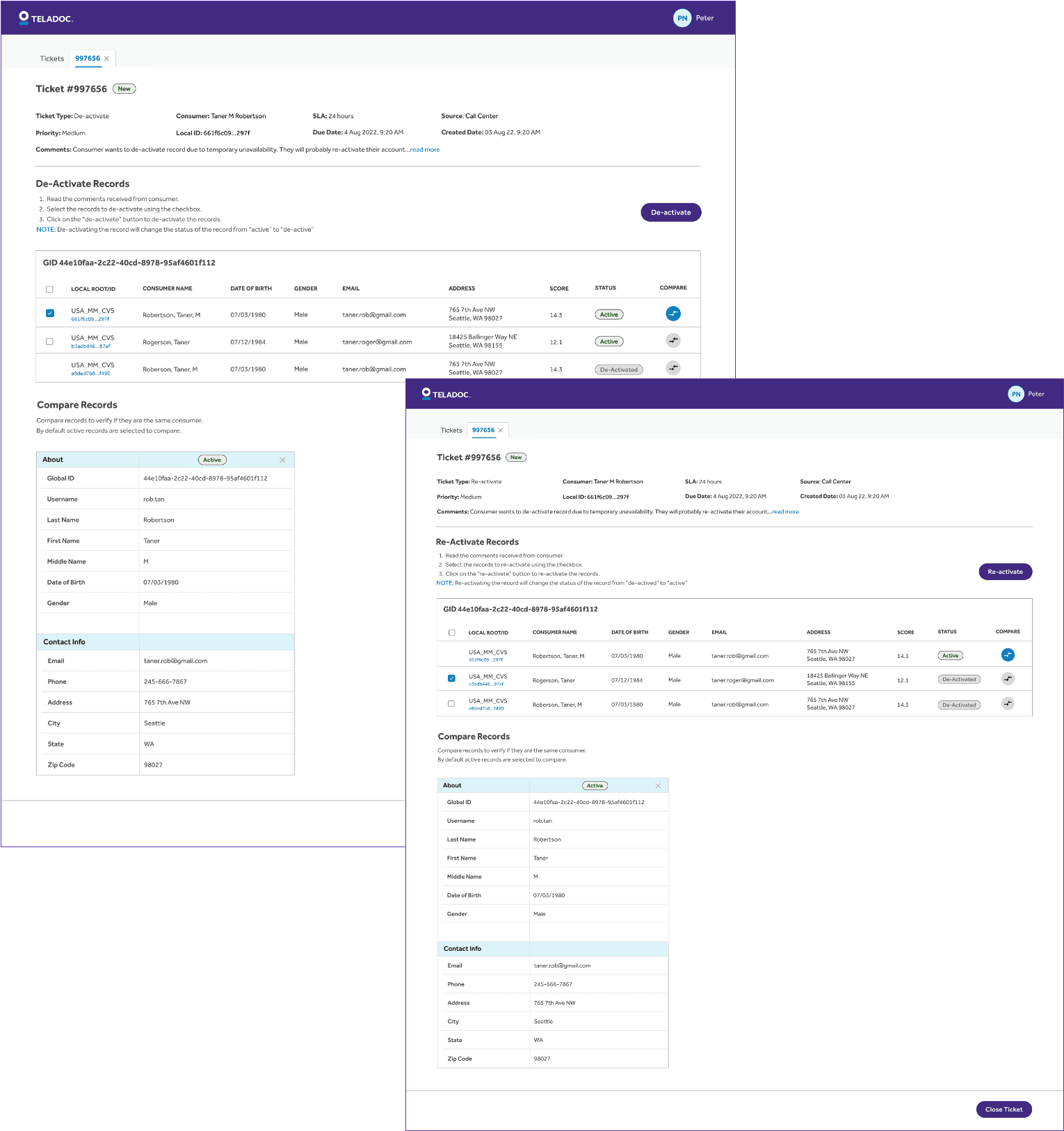
DE-ACTIVATE & RE-ACTIVATE
This allows the Data Steward to temporarily suspended based profiles due to issues like non-payment, fraud checks, or inactivity. Reactivation restores full access without losing any data.
DELETE PAGE
This allows the Data Steward to permanently delete accounts and all associated data, typically due to user request or compliance requirements (e.g., GDPR). This action is irreversible.
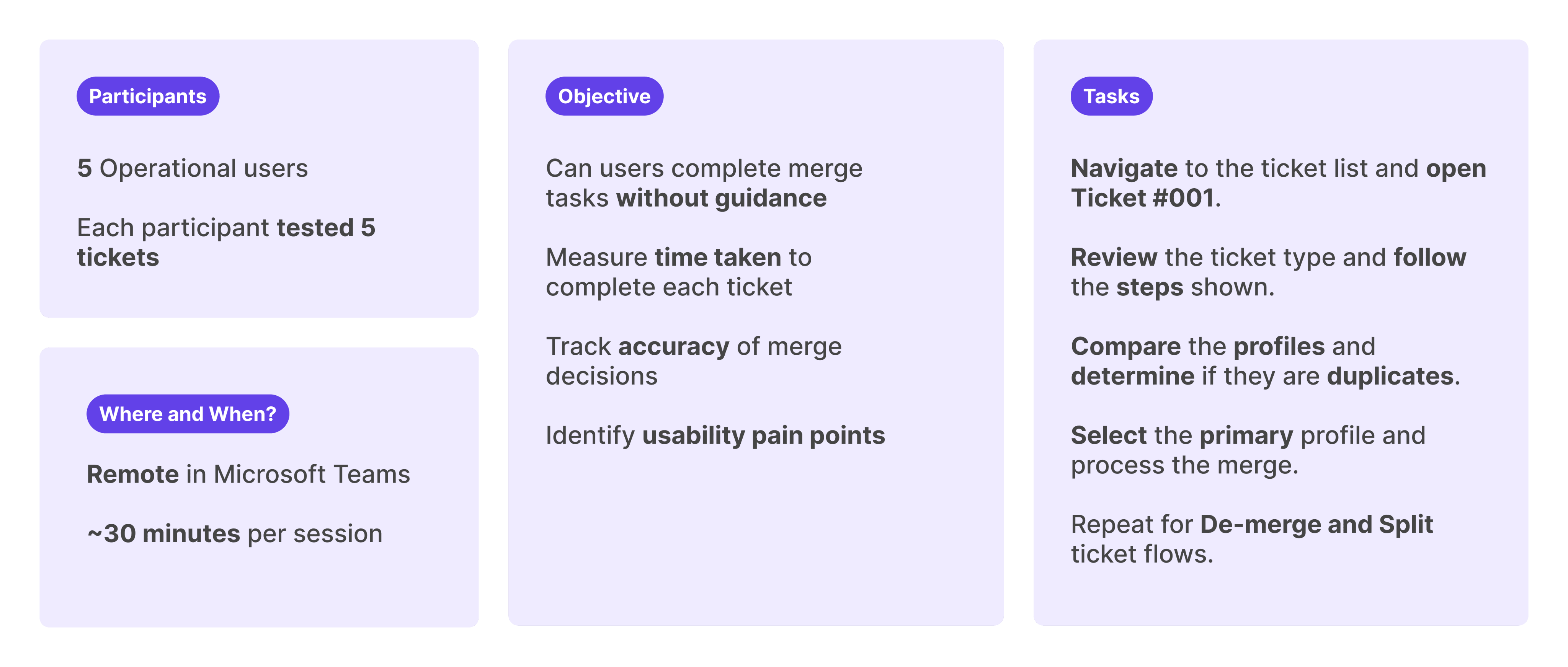
USABILITY TEST
Validating the Design: Usability Testing with Real Users to Measure Clarity, Efficiency, and Confidence
Once we completed the final mocks for the platform, we conducted a quick usability test with actual users. We tested it with five data stewards using dummy data across all the main workflows.
DEFINED QUANTITATIVE METRICS
To ensure we were gathering meaningful insights, we defined specific metrics to evaluate the usability test session. Below are the metrics we used to assess user interaction and overall platform effectiveness.
100%
Task Completion Rate
≤ 2 minute
Avg. Time to Complete One Ticket
≤ 20%
% of Participants Needing Help
≥ 90% correct
Accuracy of Final Action
ACTUAL RESULTS
All participants accurately identified duplicate profiles and successfully completed the merge tasks. Only one participant needed help with UI navigation. However, the average time to process each ticket exceeded the target of 1 minute, taking 1m 52s per ticket.
ALL 5
participants successfully completed the merge tasks without critical errors
2 MIN 52 SEC
Average time per ticket. Not meeting the goal of 1 minute
100%
accuracy in decision-making. Users correctly identified duplicates in each scenario
1
participant needed clarification in the UI
RESULTS & NEXT STEPS
Improving Efficiency Over Time
While the average processing time per ticket came in at 2m and 52s which is above our 2-minute goal. We see this as an expected starting point. As data stewards continue using the platform and build familiarity, we anticipate a natural reduction in handling time.
Our next steps were tracking real-world usage metrics, gathering post-launch feedback, and identifying further optimization opportunities to help users reach peak efficiency.